Learn languages while reading your favorite books
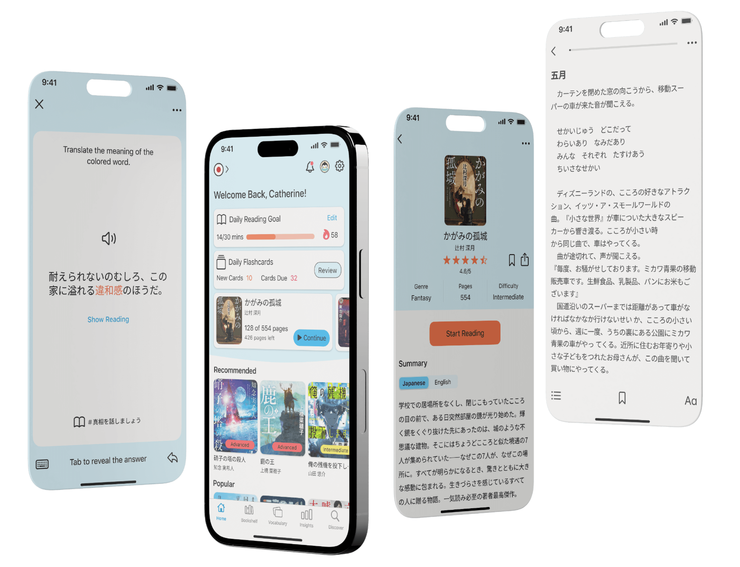
Project Overview
Background
As a passionate language learner myself, I've encountered numerous challenges and setbacks on my language journey and I understand firsthand how daunting it can be to transition to native materials. When learners begin to gain confidence with their study materials, delving into books aimed at native speakers can feel intimidating and it often shows them how much there is still to learn. This often leads to negative emotions such as overwhelm and insecurity. To prevent these feelings, it's essential to help learners ease into native reading materials and seamlessly merge language learning with the joy of reading.
Problems
- Switching between the book and an external dictionary can disrupt the reading flow.
- Evaluating a book's difficulty solely based on its cover or summary can lead to a frustrating experience when the level doesn't align with the learner's current language skills.
- While reading is an effective way to passively grow your vocabulary, translating this into an active learning experience can be daunting and tiring, often diminishing the enjoyment of reading.
Solutions
- Implement a built-in dictionary to look up words directly while reading.
- Display the difficulty level for each book so that learners can better evaluate if the book matches their skill level.
- Offer a built-in learning opportunity that uses sentences from the books users have read, enabling users to learn in context.
Defining the Direction
Asking the right questions
To gain a deeper understanding of the design requirements, I started by defining the 5WH questions. These questions helped me initially identify my target audience and the key functionalities that should be implemented in the app.
Who is the user?
- Intermediate and advanced language learners
What kind of tasks and goals will user achieve?
- Users will improve their language skills through immersive reading of authentic content.
- Users will actively practice newly acquired words.
How will the users achieve their goals?
- Users can access e-books matching their language proficiency and interests.
- Users can look up and save word meanings while reading.
- Users can practice new vocabulary with exercises or flashcards.
Understanding the user flow
Utilizing the functionalities defined during the 5WH questions, I created 4 different user flows representing the necessary steps for users to achieve their goals. In addition to the onboarding process, I outlined user flows for the book search, word saving during reading, and vocabulary flashcards.
I then translated these user flows into low-fidelity wireframes, highlighting essential elements to ensure a smooth and user-friendly experience throughout the app.
Start/End
Screen
Decision
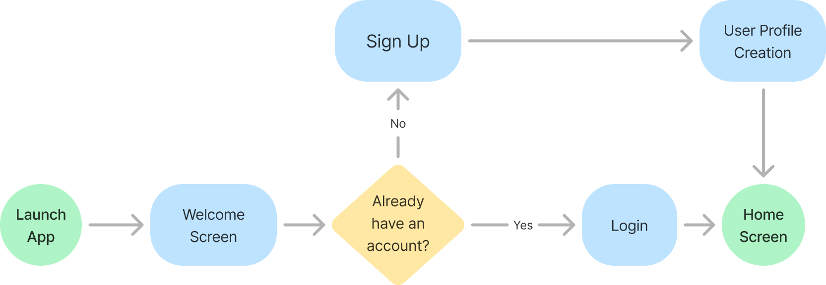
Onboarding Flow
Key Point
For a quick and easy onboarding the users can sign up with their social media accounts, select the language they want to learn and easily start to read their first book.
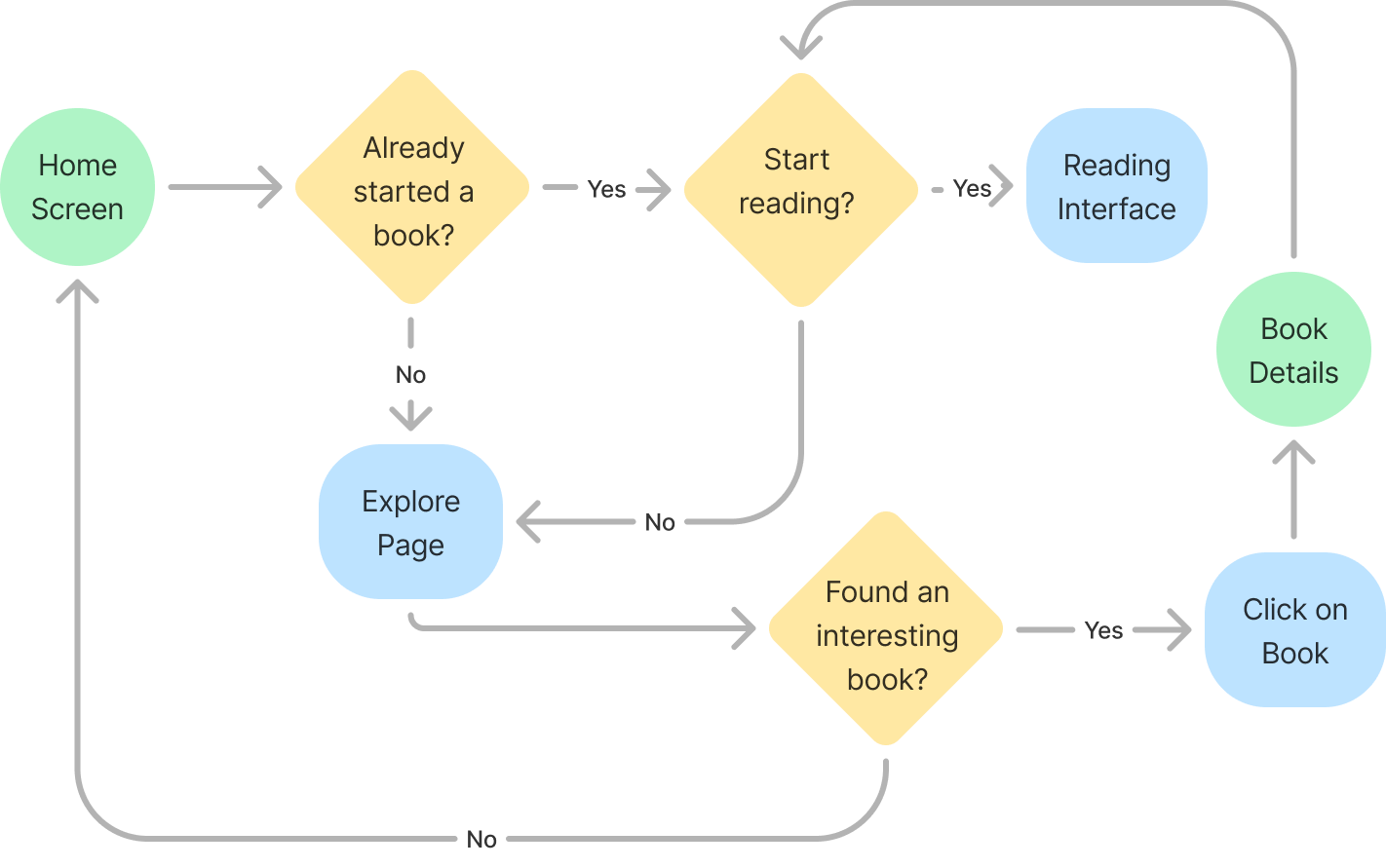
Book Search Flow
Key Point
Searching for a book should be simple and intuitive. Books can be searched via the explore page and users can easily access book details.
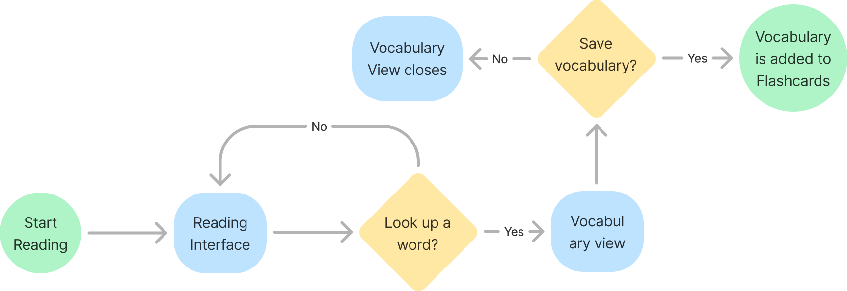
Word Save Flow
Key Point
It should be easy and intuitive to look up words while reading. A small pop-up screen shows the translation and users can save words in their flashcards.
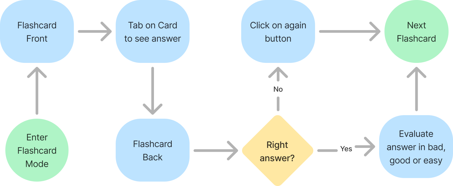
Flashcard Flow
Key Point
From their vocabulary list users should be able to easily access their flashcards.
From Planning to Visual Design
Refining the Wireframes - From Low-Fidelity to High-Fidelity
The wireframes I initially created, based on the user flows, were minimal, focusing solely on essential flows and functionalities. Through further iterations, I refined the screen layouts and developed a visual style for the app. Given that the app aims to create an immersive environment for language learners to focus on improving their skills, the visual design is intentionally minimal and unobtrusive, allowing users to concentrate on their reading content without distractions.
Uncovering Usability Problems
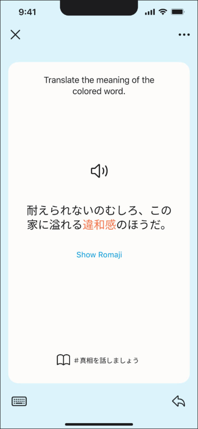
With my high-fidelity wireframes, I created prototypes to test with users and collect their feedback for further improvements. The user tests revealed that users had difficulties understanding the flashcards correctly. They were unsure how to input, receive feedback, or evaluate their answers using the colored buttons. Since this presented a significant usability issue that could result in a poor user experience, I iterated on ideas to better inform the user about what was happening.
Problem 1
Users were uncertain about the input method and how to receive feedback on their answers.
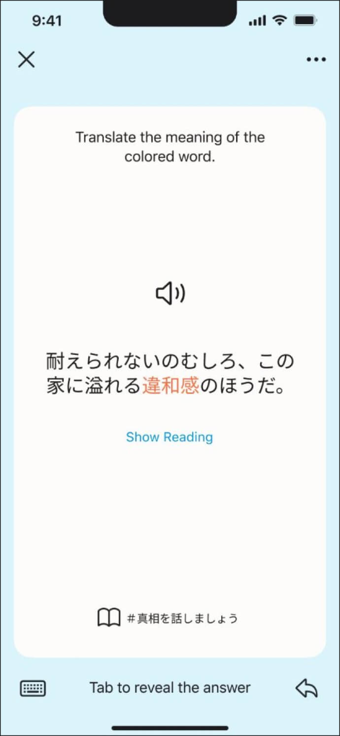
Solution 1
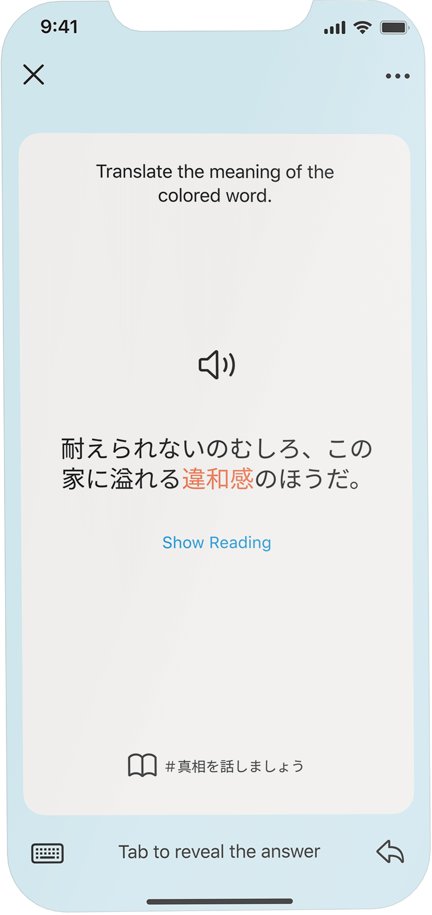
I added the text 'Tab to reveal the answer' at the bottom of the screen to cue users to flip the card and reduce ambiguity.
Problem 2
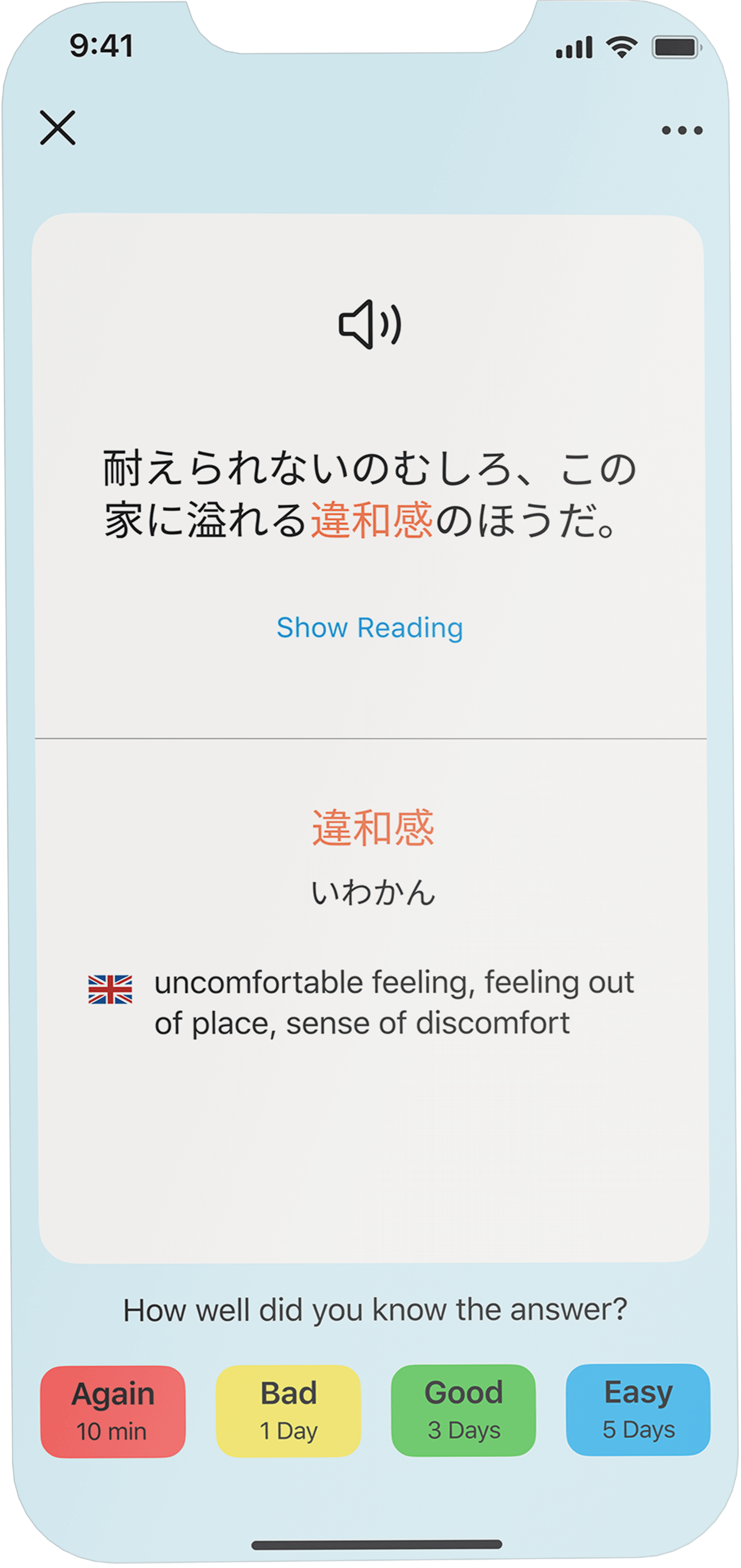
Users were unsure about the purpose of the colored buttons on the bottom on the screen.

Solution 2
To address this issue, I introduced two distinct solutions to improve the flashcard experience at different stages of the flow.
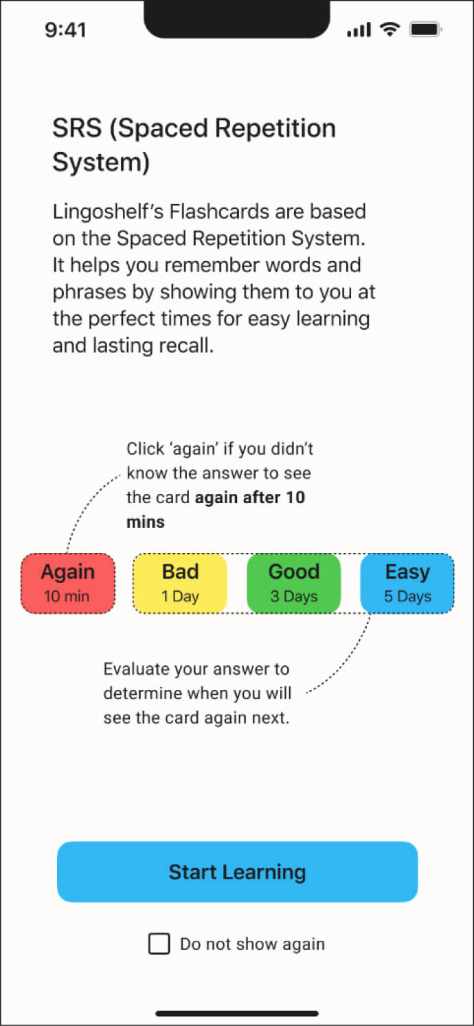
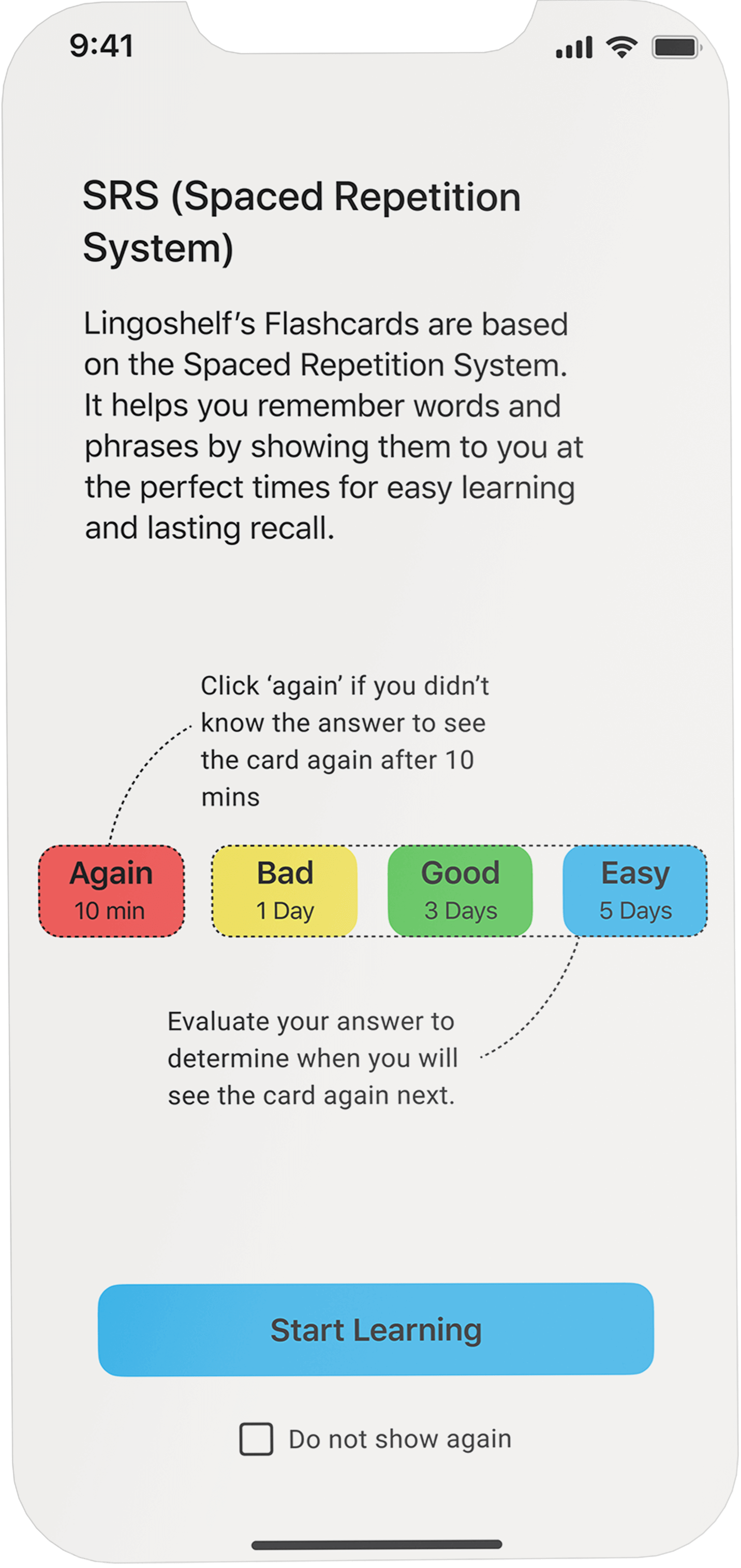
User testing revealed that not everyone is familiar with SRS-based flashcards. That is why I decided to introduce an additional screen to explain SRS when users access their flashcards for the first time.
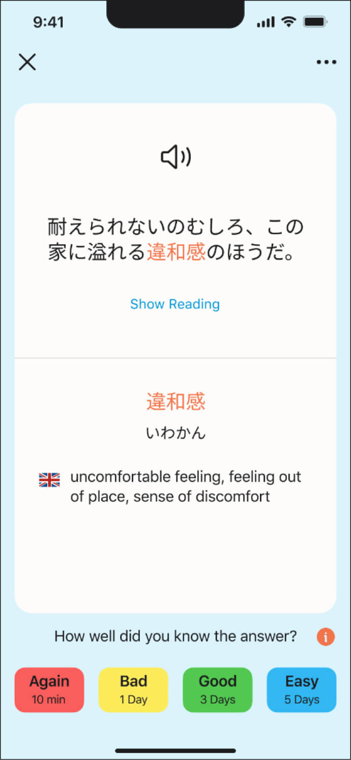
The second solution mirrors the approach taken for the first problem: I added a cue directly on the screen to remind users of the buttons' functionality.
Creating an Immersive Learning Experience
Learn languages by reading your favorite books
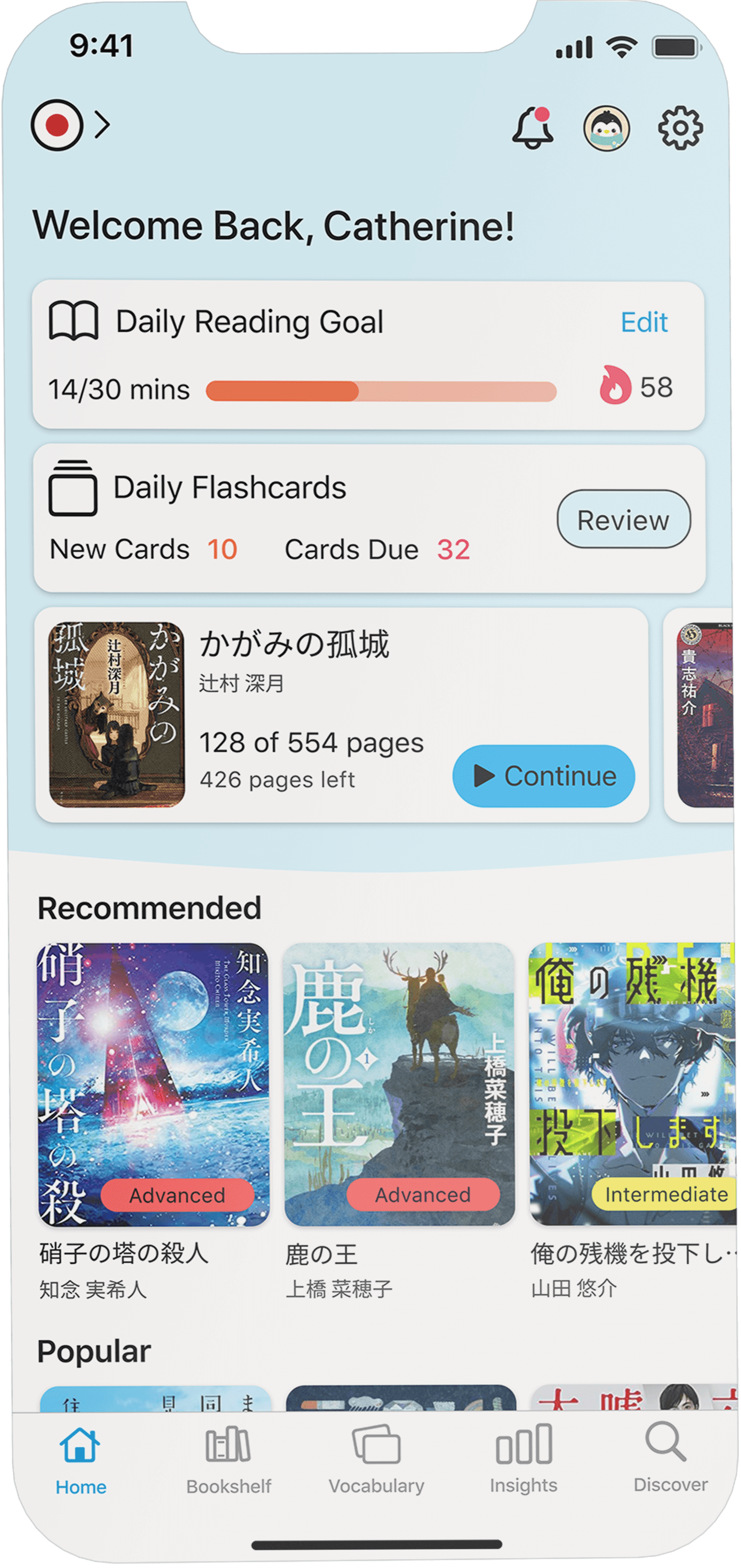
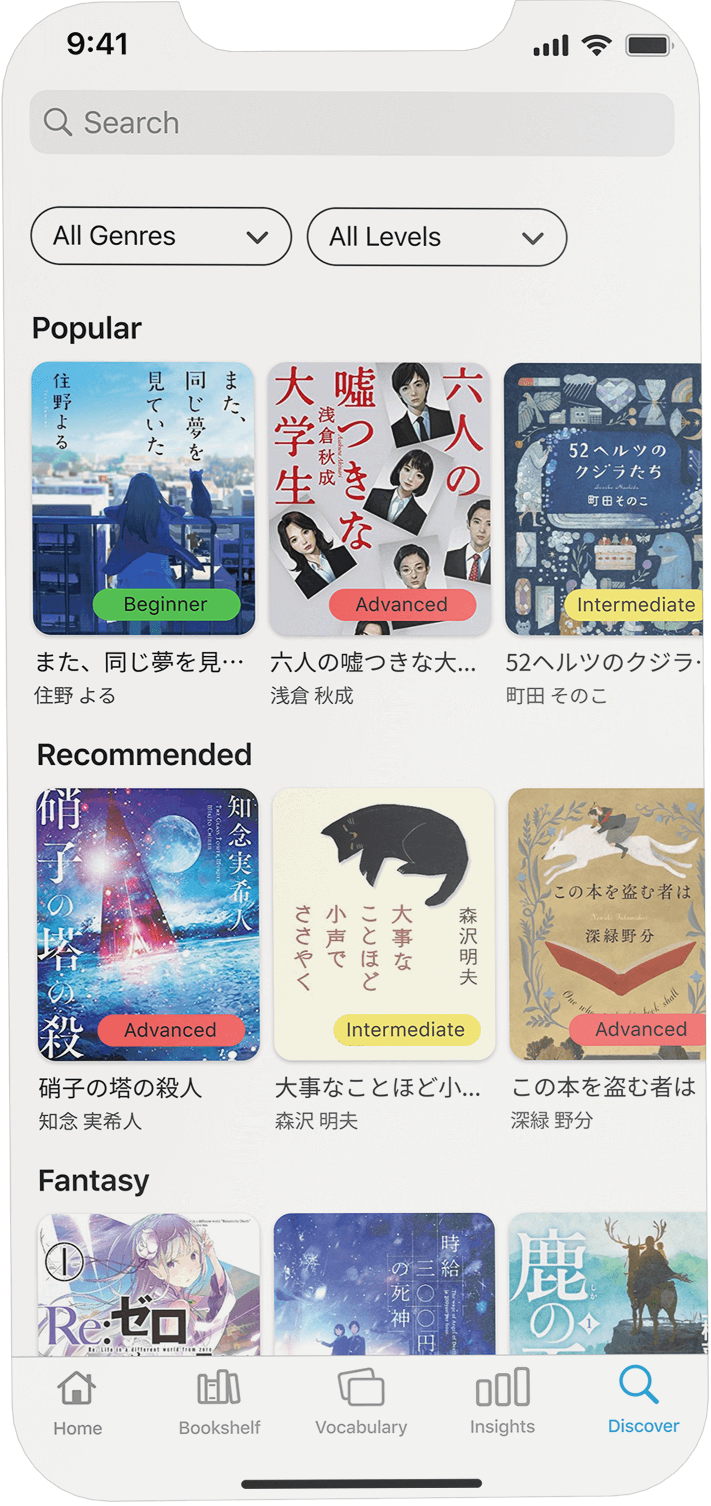
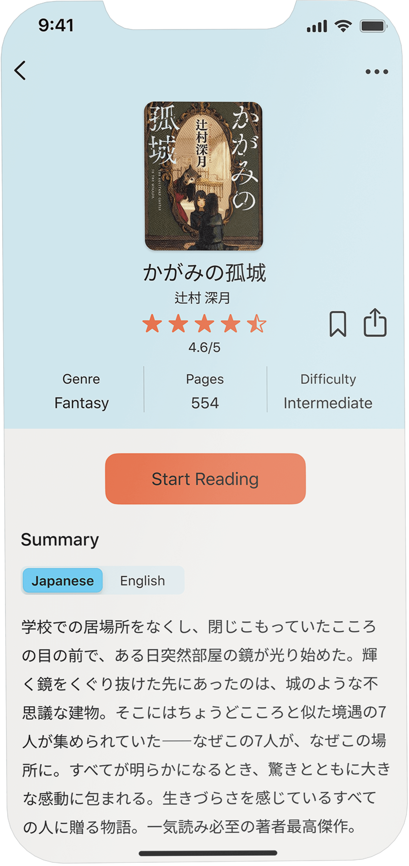
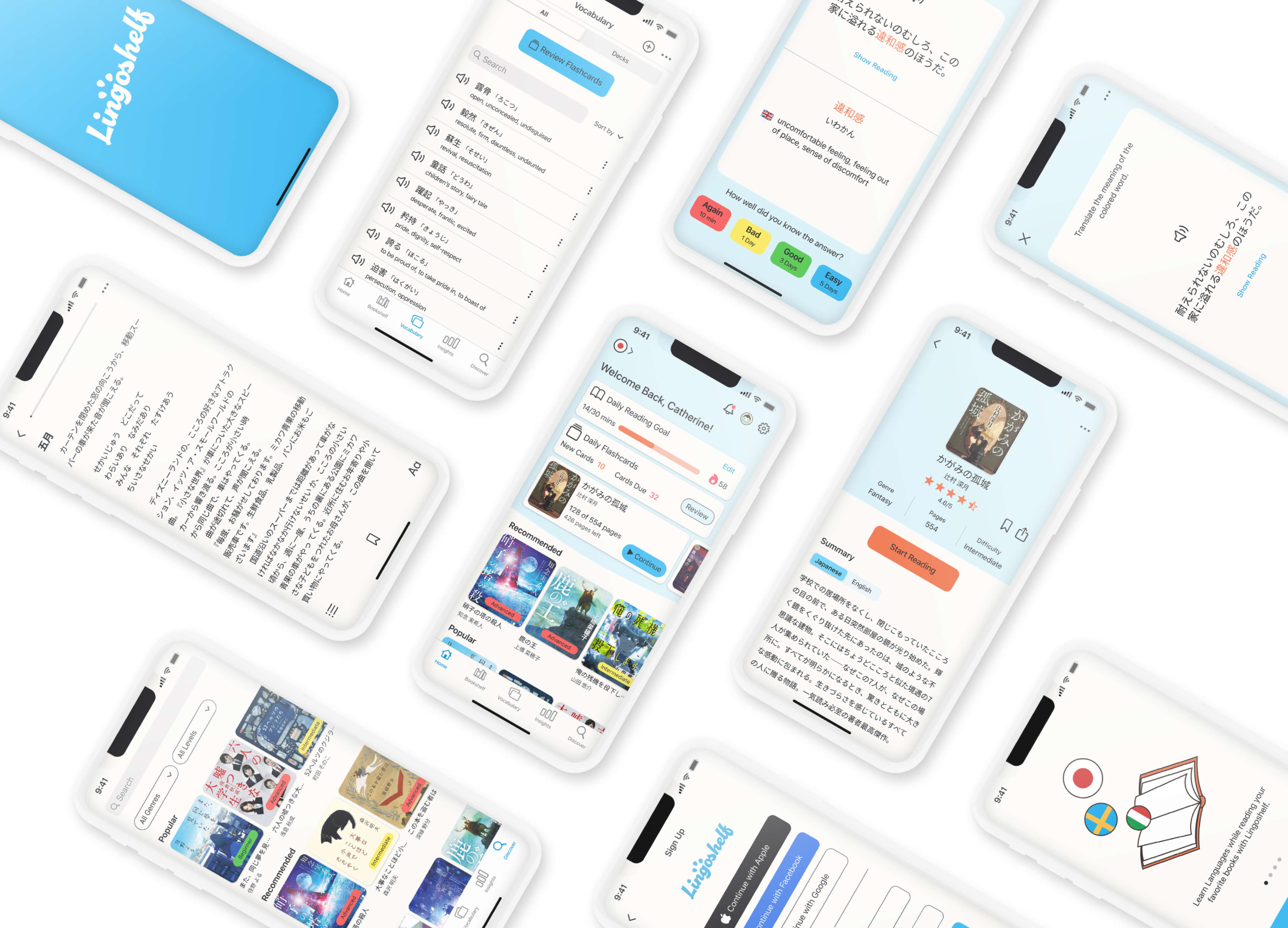
Lingoshelf offers a huge library of literature in a variety of languages. Users can search for books that match their language skills and interests for an enjoyable learning experience.
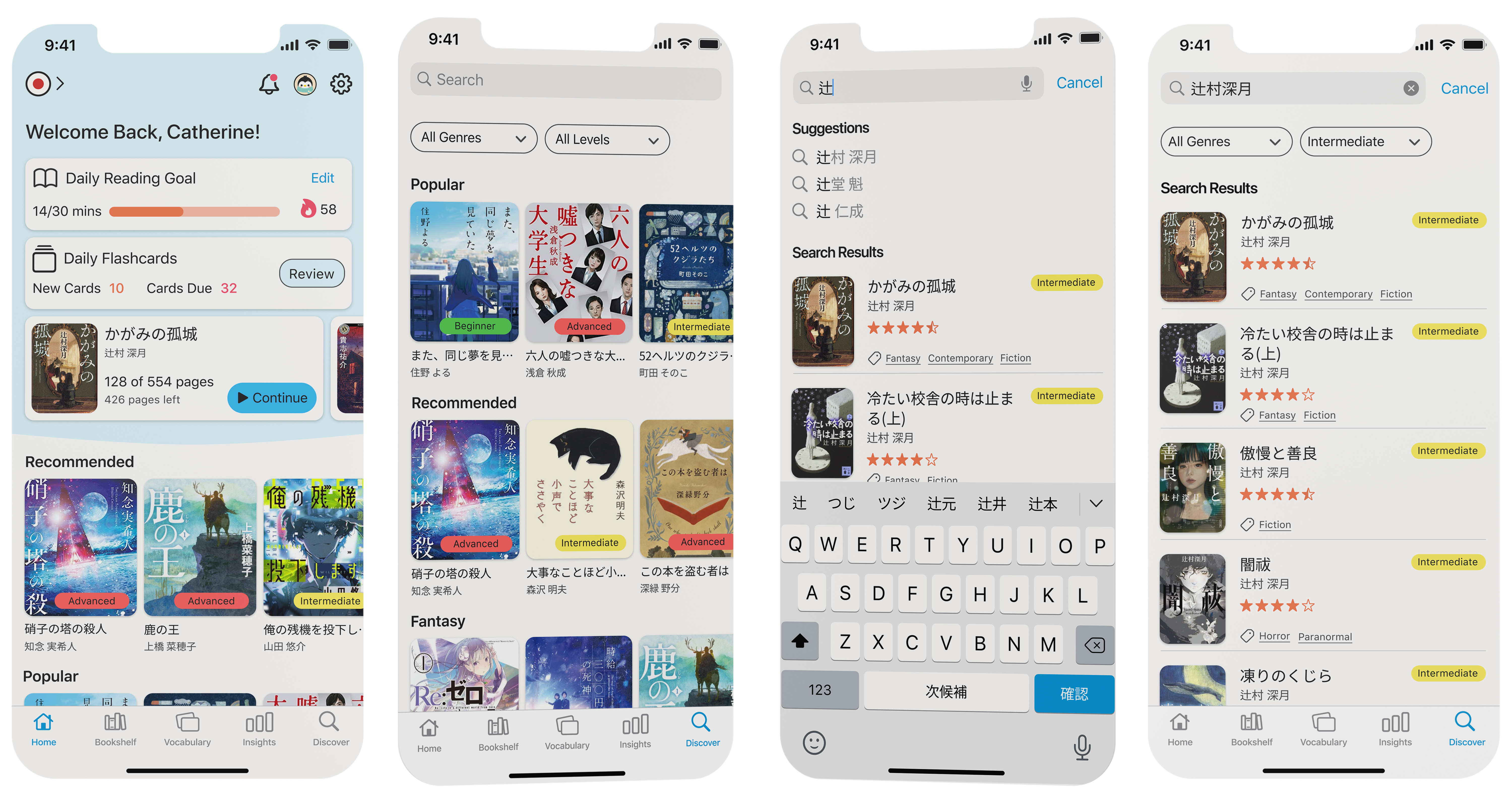
Due to the tags indicating difficulty levels, users can easily find books that match their personal skill level.
Discover new books you'll love by browsing Lingoshelf's extensive collection.
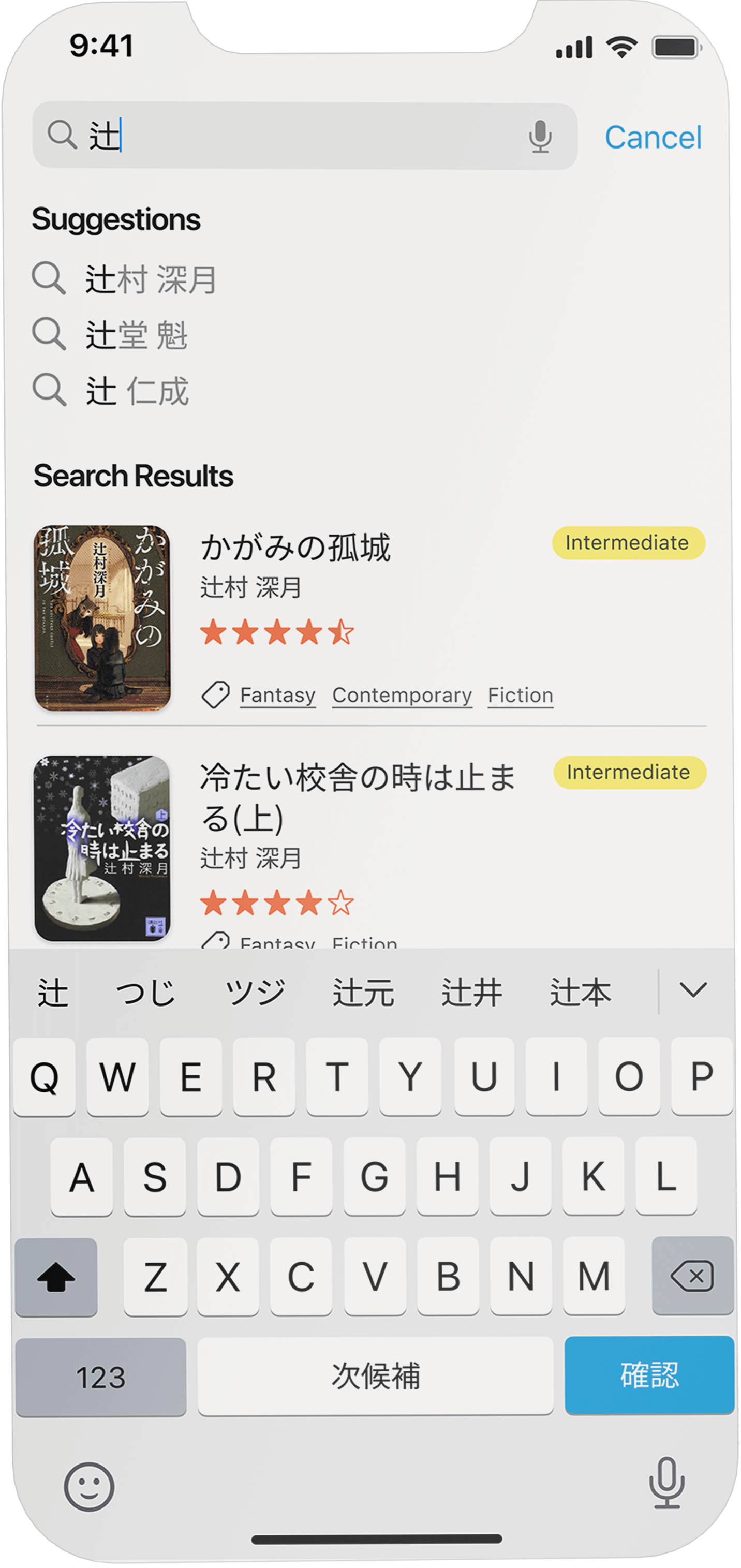
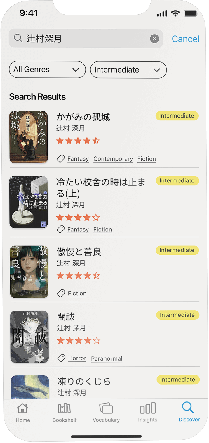
Search for your favorite authors or books and simply start reading.
Look up word meanings while reading and save new vocabulary
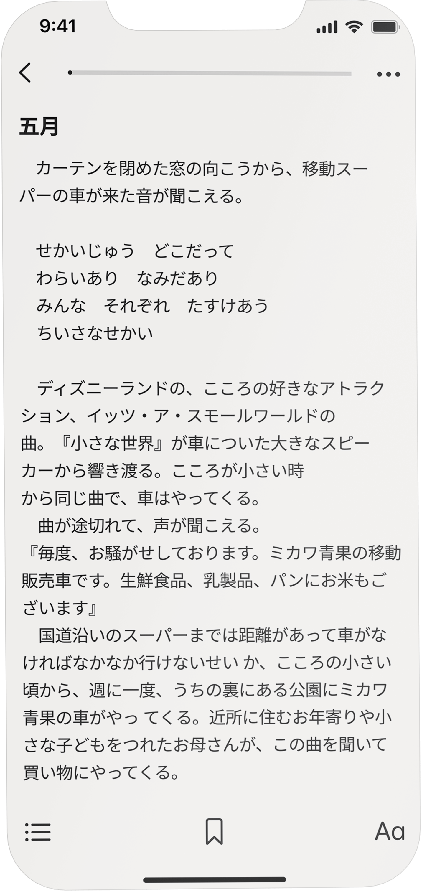
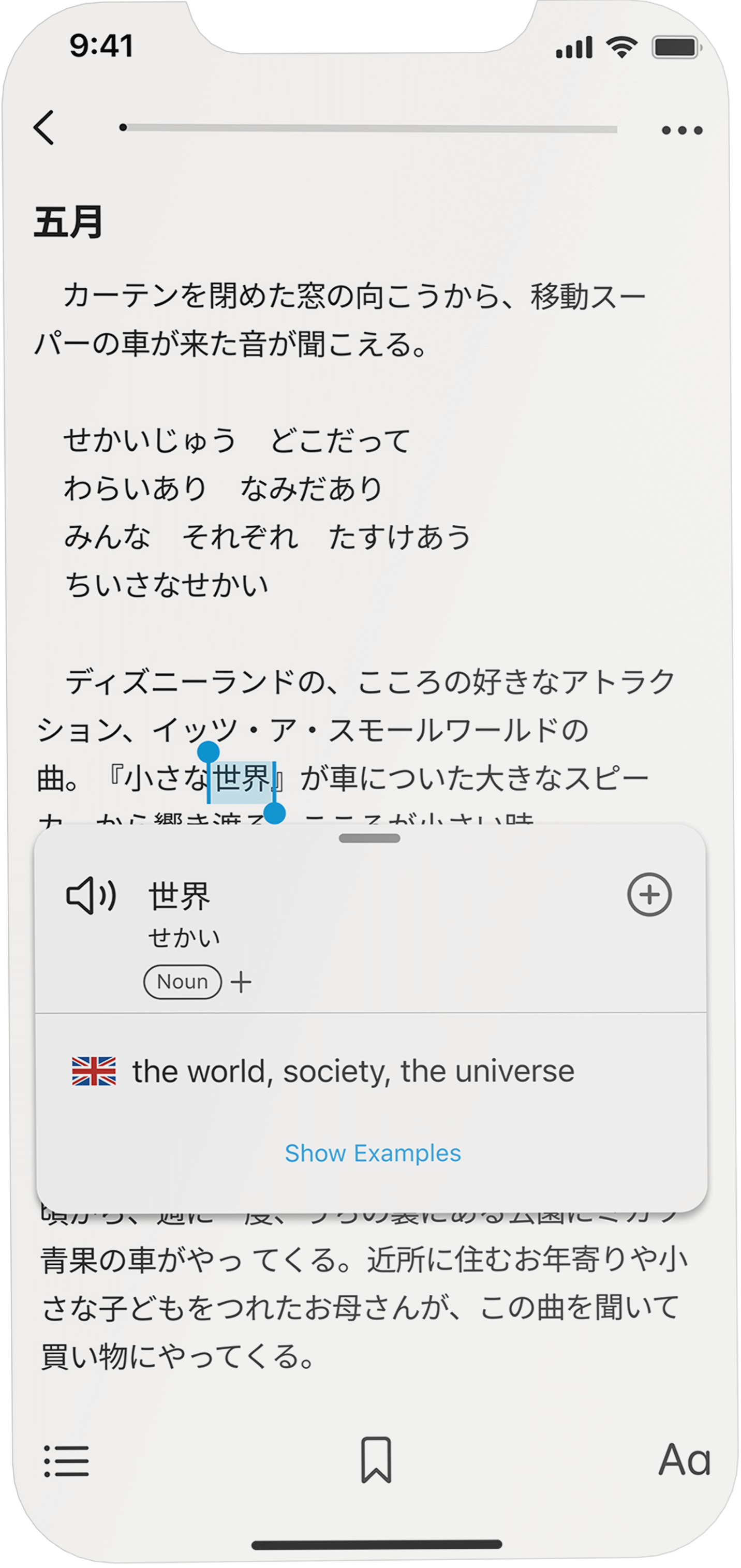
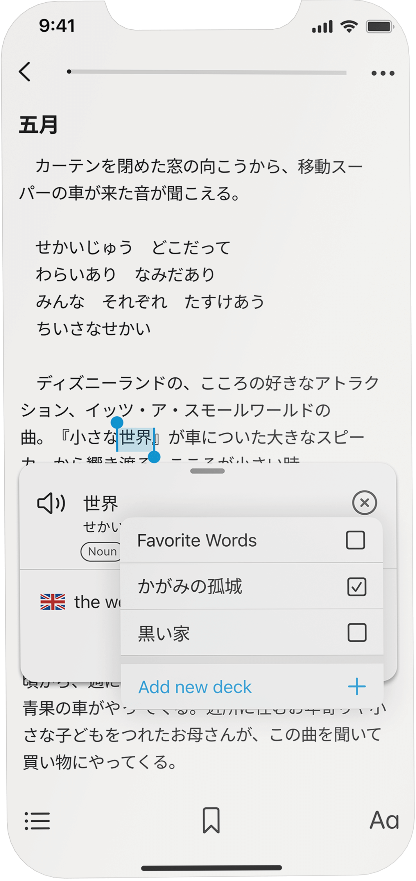
Users can look up the meaning of words directly while reading without the need to rely on an external dictionary. They also can save words for later reference and add them to different flashcard sets.
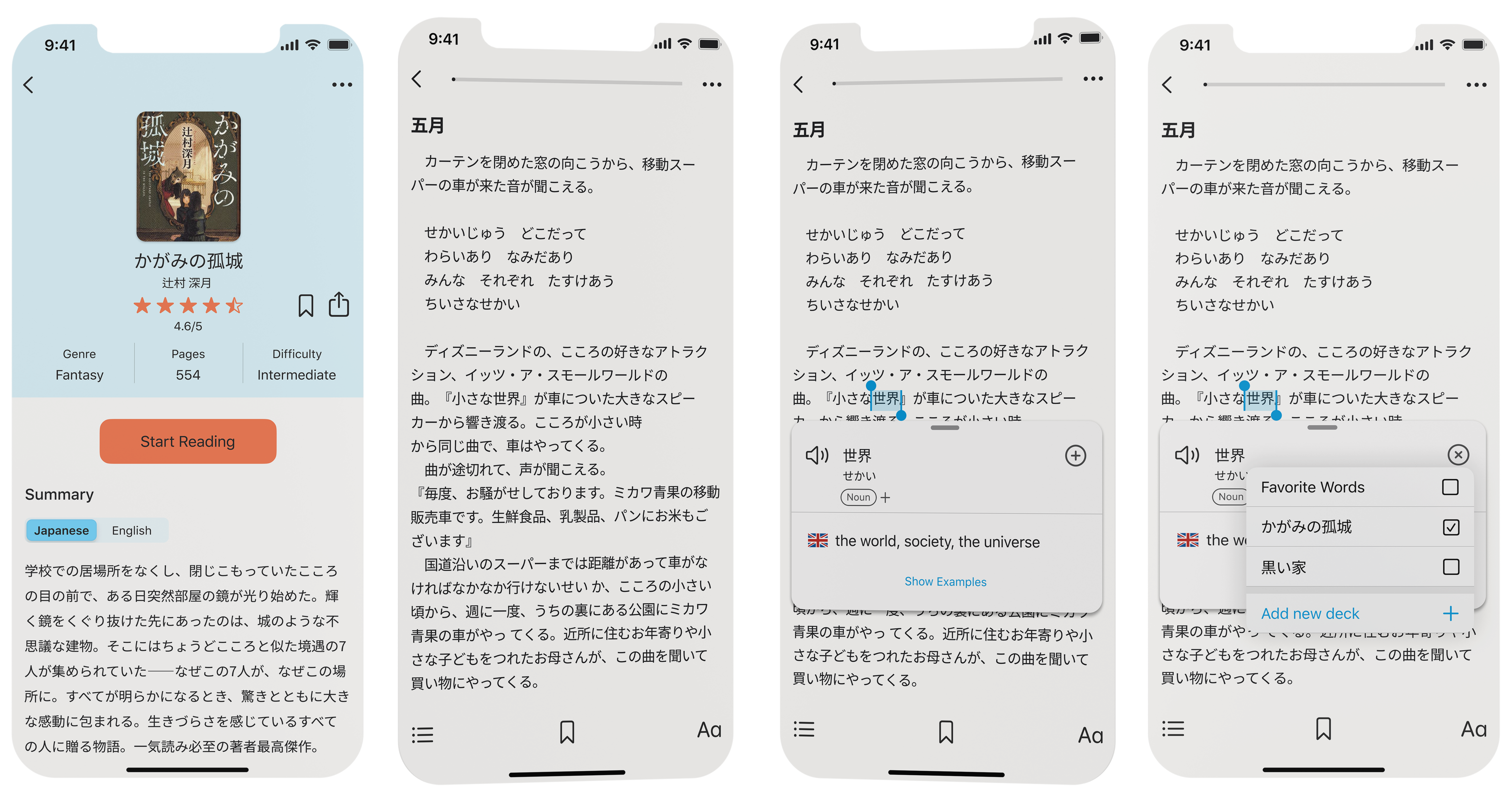
Read without distraction and immerse yourself in your target language.
Simply click on a word to look up its meaning.
Save words in vocabulary decks to organize new words and flashcard sets for targeted learning.
Practice new words with SRS based Flashcards
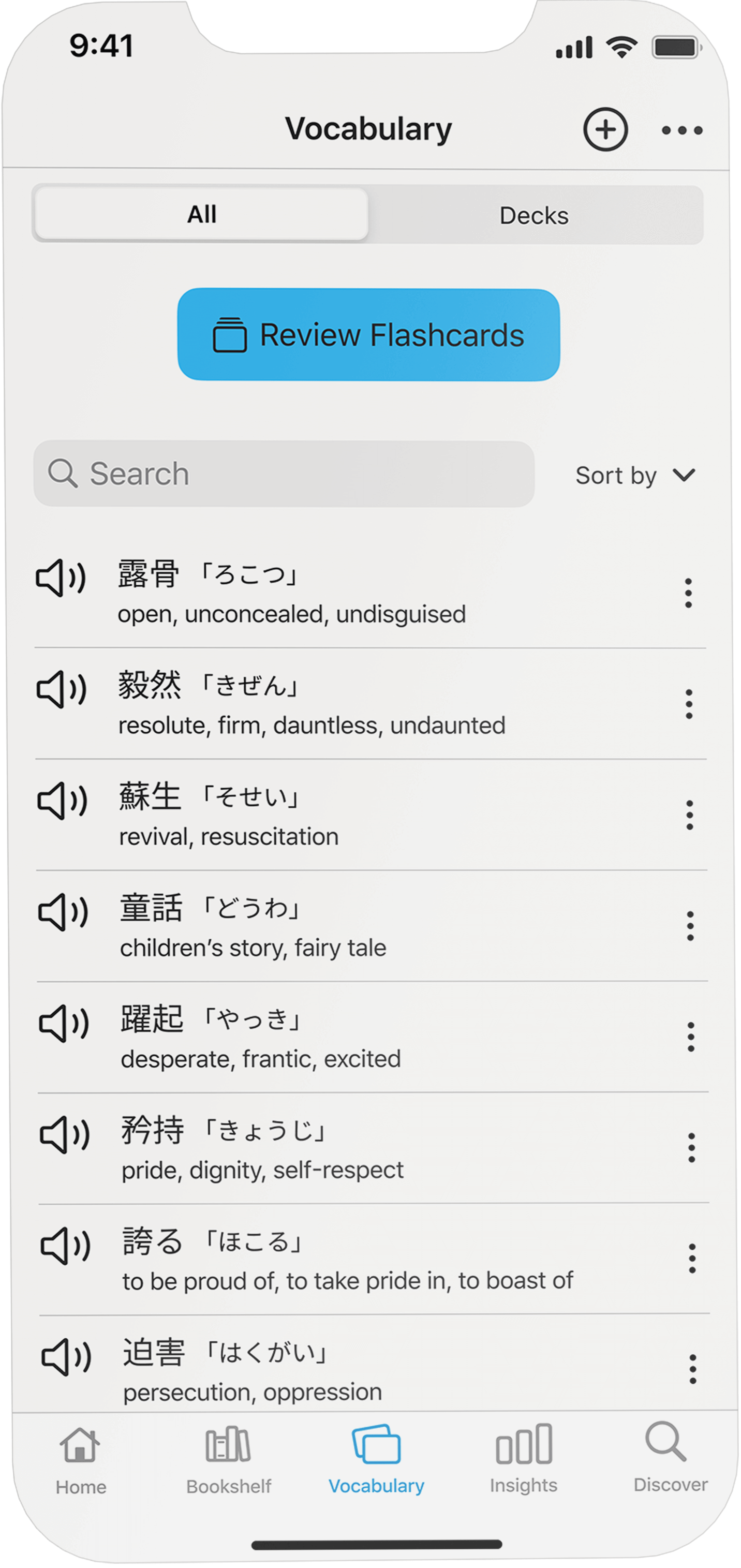
Lingoshelf utilizes spaced repetition to offer an effective method for actively practicing saved words, in addition to the more passive and immersive reading approach. Flashcards display words in sentences that users have encountered during their readings to provide context and enhance memorization.
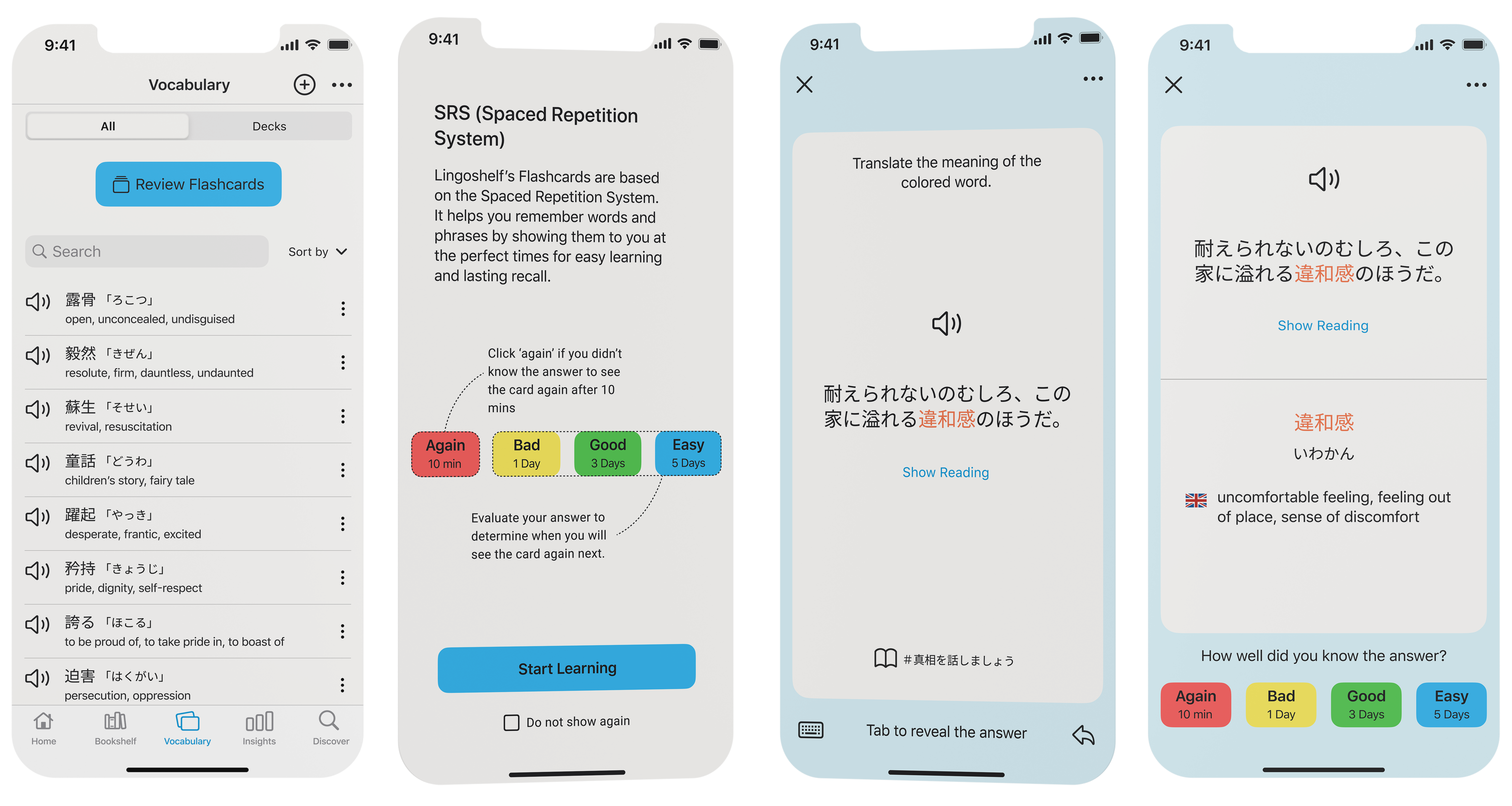
Add your own vocabulary by clicking on the plus icon.
Easily access your saved vocabulary and look up words.
Flashcard show the words in context by using sentences you have encountered while reading different book.
By choosing the words difficulty the SRS determines when you will see the word next time to support optimal word retention.
Try it!
What I've learned
Be aware of your own biases
Being a part of the product's target audience yourself can provide an advantage as it allows you to empathize better with the user's perspective. However, it can also be a disadvantage as it may make you more susceptible to biases based on your own preferences. Therefore, it is crucial to remain aware of these biases and be willing to set aside personal preferences when user research and testing reveal different needs and preferences.
Consider users who may not appear to be your target audience at first glance
To avoid designing in isolation and excluding individuals who may have less experience with language learning, it is essential to involve people from diverse backgrounds in both the research and design phases. This approach yields valuable insights and prevents the pitfall of designing exclusively for one specific group


