An engaging and motivating approach to money savingand environmental protection
Project Overview
Background
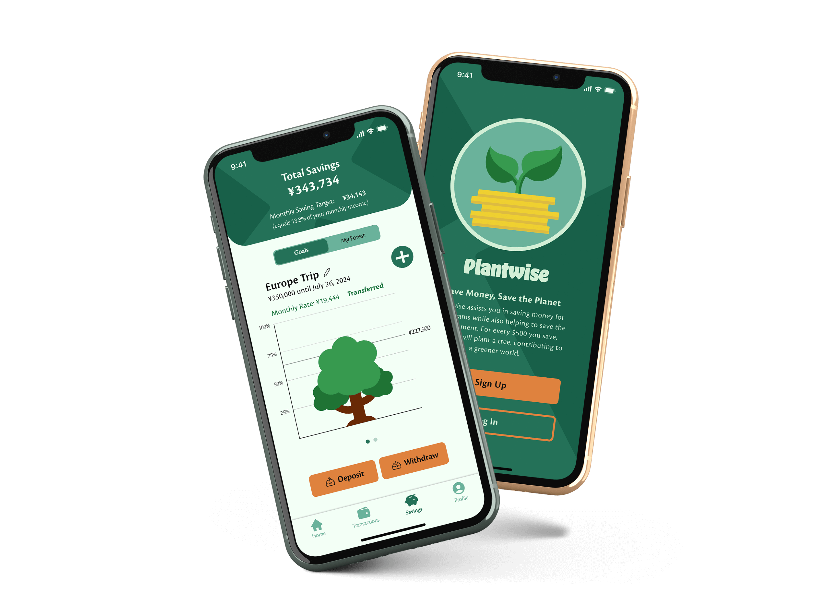
For many, handling money and addressing environmental concerns can be intimidating, making their implementation in our lives challenging or bothersome. Nevertheless, both are crucial topics that we shouldn't neglect, as they can have negative outcomes in the long run if overlooked. To bring everyone on board with these seemingly difficult issues, Plantwise adopts a gamified approach, making personal finance management and contributing to the environment motivating and engaging for everyone, regardless of expertise.
Challenges
- Unite a challenging topic like personal financial management with fun and engaging gaming elements to motivate users who may not enjoy dealing with their finances.
- Managing money can be overwhelming, leading many people to avoid dealing with it altogether. To make money management less intimidating, the app must offer an easy and understandable interface with functionalities that enable users to spend less time on their finances while still achieving positive outcomes.
Understanding User Needs
Why do people refrain from financial management and what would motivate them?
To tackle the challenges mentioned above, I began by questioning why personal finances are often perceived as an 'evil villain' and how I could assist people in combating this adversary. To achieve this, I initiated user interviews to gain a deeper understanding of my audience's struggles. These interviews unveiled the pain points and needs of my participants concerning money saving.
Pain Points
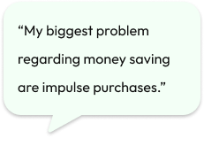
- Impulse Purchases
- Unplanned expenses
- Apps for financial management are often to complicated
Needs
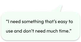
- A way to store savings out of reach
- Flexible saving options.
- An app that is easy to use and can be simply accessed from everywhere.
From Interview Findings to User Personas: Unwinding User Pain Points and Goals
With the insights gained from my interviews, I created two personas, Ally and Matthew, to represent the pain points and goals of my target audience. These personas helped me give my audience a more tangible identity and guided the development of features tailored to the users.
Ally

“It is challenging for me to save the same amount every month.”
- Age:
- 24 years
- Occupation:
- Freelance Copywriter
- Monthly Income
- Instable (1,000 $ - 3.000 $)
- Family
- Single
- Interests
- Traveling, Writing, Camping
- Goals
-
- Building a travel fund.
- Track her income and expenses.
- Pain Points
-
- Difficulty in setting aside a fixed amount.
- Lack of visibility into her spending habits.
- Forgetting to track expenses.
- Needs
-
- Flexible budgeting options.
- Integration with her bank accounts.
Mathew

“As long as the money is available for me I will spend it.”
- Age:
- 36 years
- Occupation:
- Electrician
- Monthly Income
- Stable: $3,500
- Family
- Wife, 2 kids
- Interests
- Movies, Soccer, Cars
- Goals
-
- Save money for specific products or occasions.
- Pay off debts.
- Pain Points
-
- Feeling overwhelmed by financial responsibilities.
- Not being able to save enough money.
- Often spends money on impulse.
- Dealing with unexpected expenses.
- Needs
-
- Budgeting and financial planning.
- Transfer money to a separate saving account.
- Security of financial information.
From Research to Ideation: Building the app
Developing the structure of the app
With a clear understanding of the target group’s needs and pain points, I began iterating on a user flow to explore ways to integrate meaningful features that address these needs while maintaining an easy and intuitive structure.
The onboarding process should feel both intuitive and trustworthy, given that the app handles sensitive data. The transaction flow needs to be swift and straightforward to avoid unnecessary complexity, as users are likely to rely on this feature daily. Lastly, the saving goal flow should be engaging and motivating, encouraging users to stay committed to their savings journey and ultimately achieve their financial goals.
Start/End
Screen
Decision
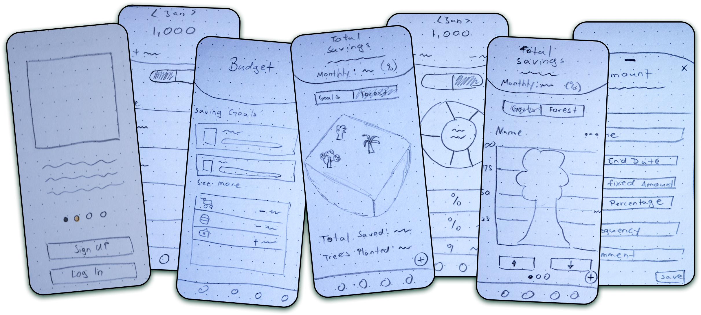
Iterating and idea creation: The development of the screens
At this point, I already had a decent understanding of the app's requirements and the necessary screens for a good user experience. However, figuring out how to layout the features on the screens and create a visually appealing app posed a different challenge. Overcoming this hurdle required many pieces of paper and some strolls outside to finally come up with solutions that I felt comfortable working with, ultimately defining the first rough structure of the app.
Prototyping and testing the usability of the design
I believe we've all reached a point where ideas that seem intuitive to us can be confusing to others. Therefore, testing the design with real users is crucial. To do this, I created a prototype to assess if users could achieve their goals seamlessly and to identify potential pain points in my design that could lead to an unpleasant user experience.
I recruited four participants and assigned them three distinctive tasks to complete. While the testers navigated the app and fulfilled the tasks without any problems, the testing revealed two points that needed addressing to improve the navigation and overall user experience of the app.
Problem 1:
Buttons are too small and difficult to reach.
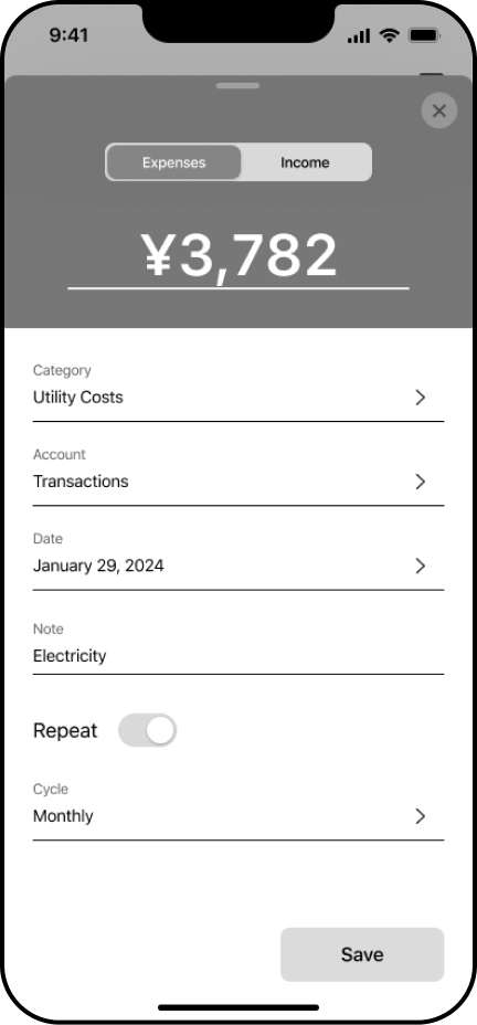
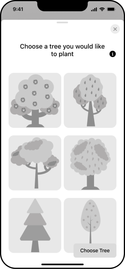
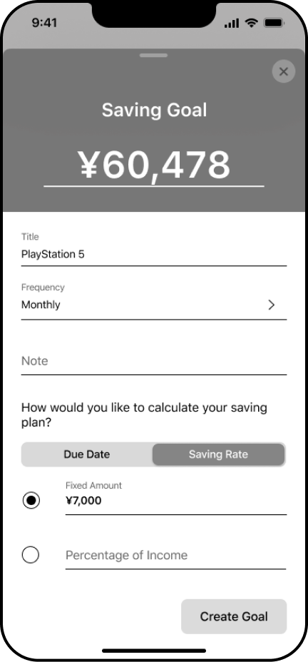
Buttons were right-aligned what made it difficult to reach when holding the phone with the left hand.
Solution:
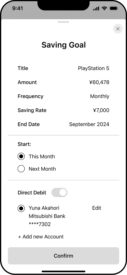
To provide a better user experience and make the button easier to reach from different positions I decided to center the button and increase its size. This adjustment not only improves usability but also contributes to a more balanced layout.
Problem 2:
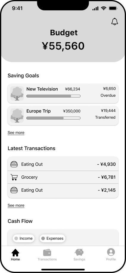
The Home Screen lacks the feature to directly add transactions or saving goals.
Solution:
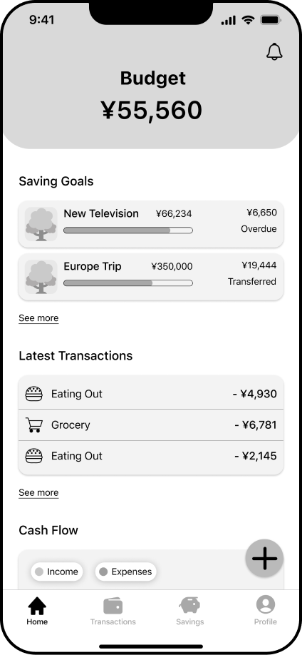
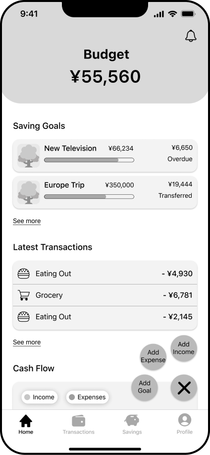
To provide an easy and fast way for users to add new transactions and goals I decided to implement the plus button also on the home screen.
The Visual Design: From Style Guide to Screen Implementation
Following the user tests and the implementation of improvements in my grayscale wireframes, I progressed by further developing the app's identity. This involved deciding on a color palette, typography, and the style of different elements. Plantwise embodies a gamified approach to money-saving and management with a focus on the environment. To seamlessly integrate the brand's key principles within the app, I aimed to select colors and fonts that create a fun atmosphere, conveying the essence of nature and the environment to the user.
To achieve this, I opted for greenish hues as primary and secondary colors, with an earthy orange as the accent color. Additionally, I chose a round and friendly typography to emphasize the playful nature of the app.
Colors:
Primary
-
HEX:
#247158
-
RGB:
(36, 113, 88)
-
HSL:
(161, 52%, 29%)
Secondary
-
HEX:
#186049
-
RGB:
(24, 96, 73)
-
HSL:
(161, 60%, 24%)
Accent
-
HEX:
#DF823E
-
RGB:
(223, 130, 62)
-
HSL:
(25, 72%, 56%)
Black
-
HEX:
#0F0F0F
-
RGB:
(15, 15, 15)
-
HSL:
(0, 0%, 6%)
White
-
HEX:
#F3FFF6
-
RGB:
(243, 255, 246)
-
HSL:
(135, 100%, 98%)
Typography:
Hobeaux
Cronos Pro
Buttons:
Dealing with sensitive data: Building up trust during the onboarding process
To ensure the protection of user data, I implemented a verification process and the setting of a passcode within the onboarding process. As an app dealing with sensitive user data, it's important to establish trust from the beginning, allowing users to engage with the app carefree.
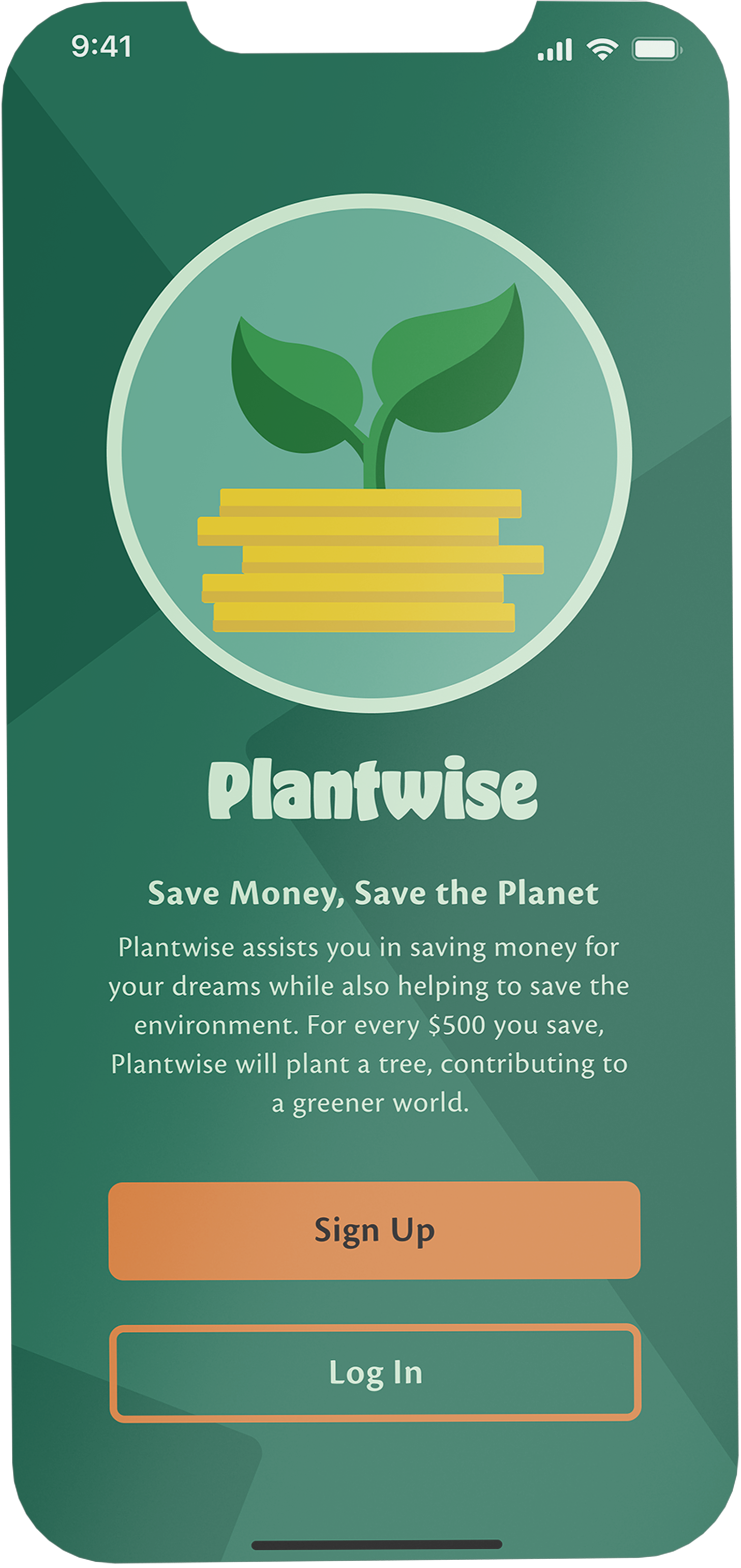
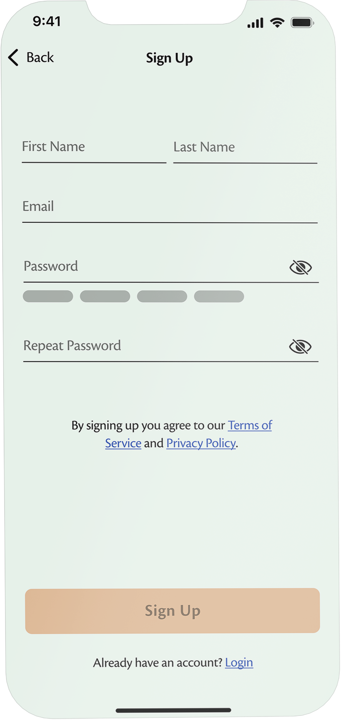
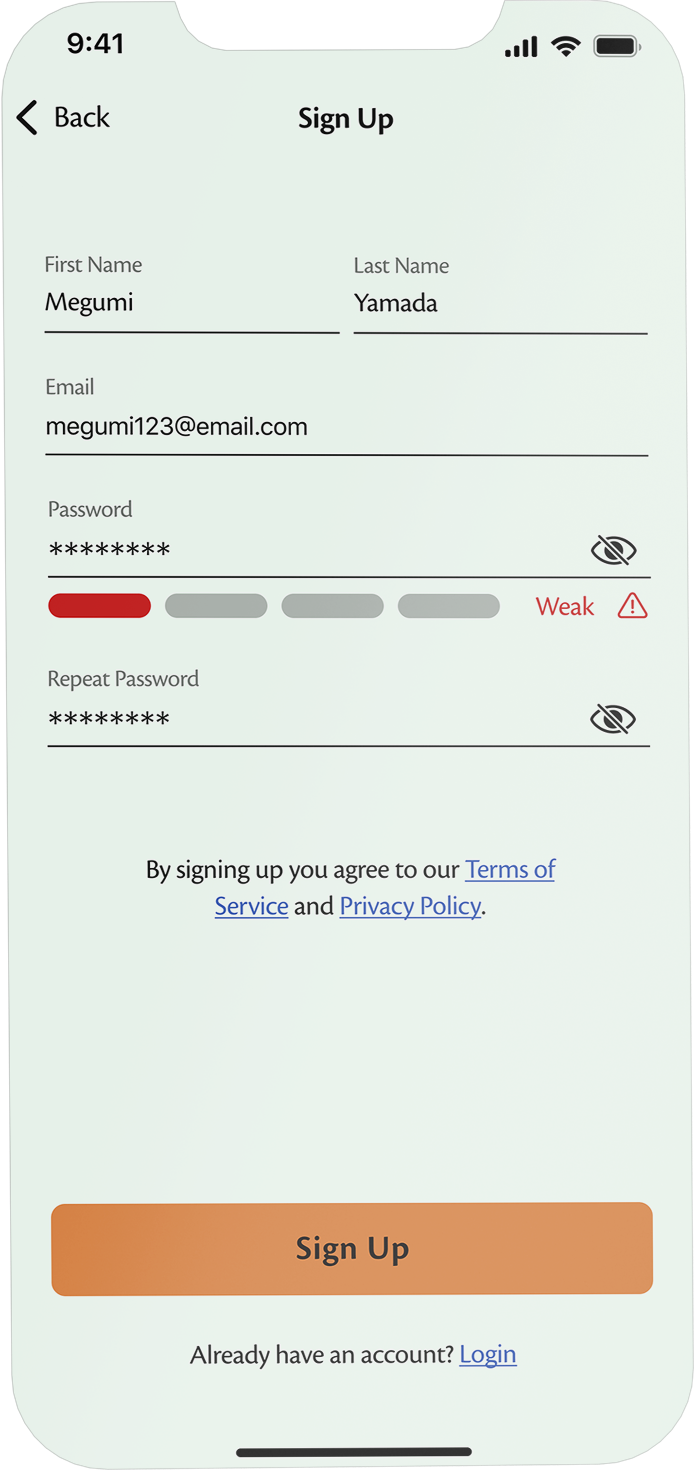
To safeguard user data, Plantwise employs a secure sign-up process, guiding users in setting optimal protection measures, such as ensuring password security.
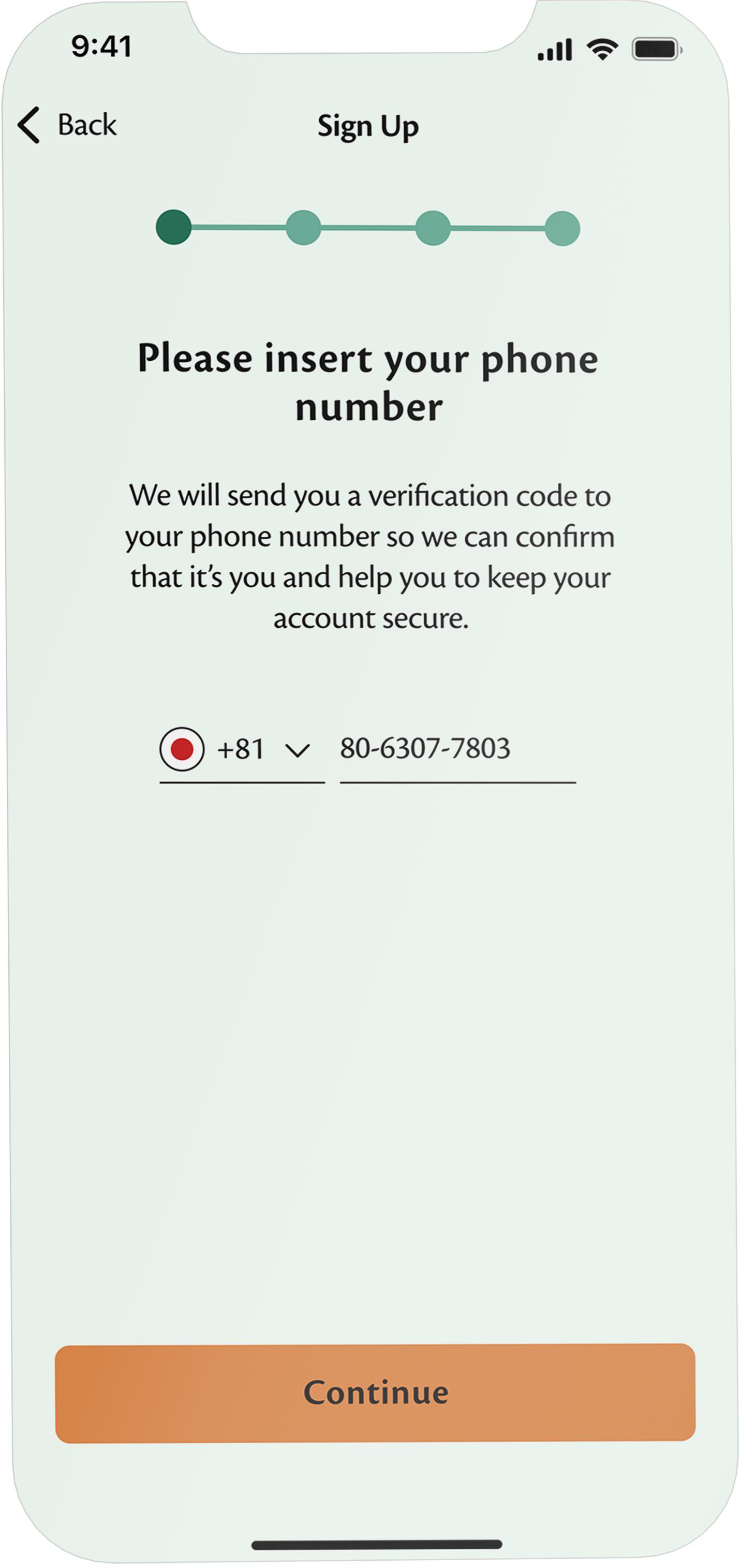
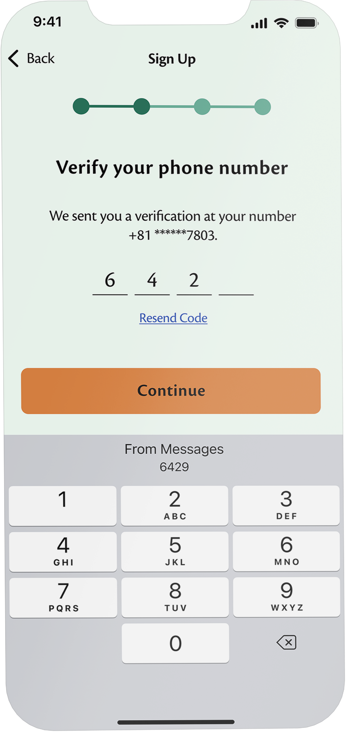
The verification of the user's phone number helps confirm their identity and ensures the safety of the account.
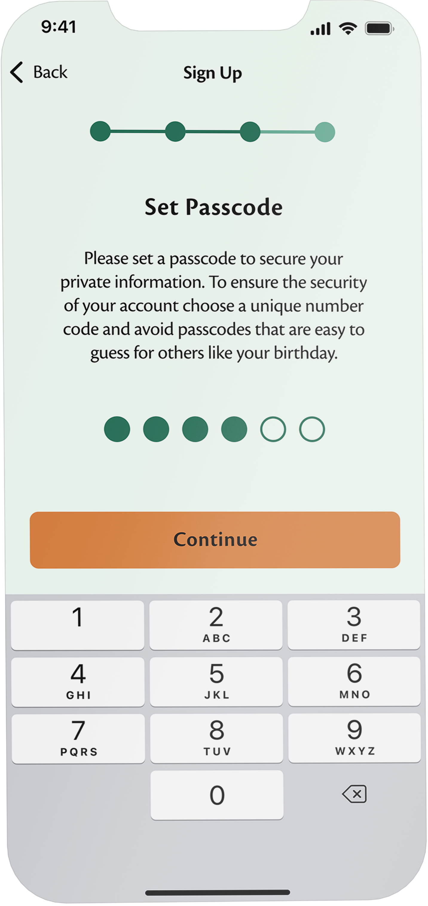
Setting a passcode ensures that transactions can only be initiated by the user, protecting them from unauthorized transactions by third parties.
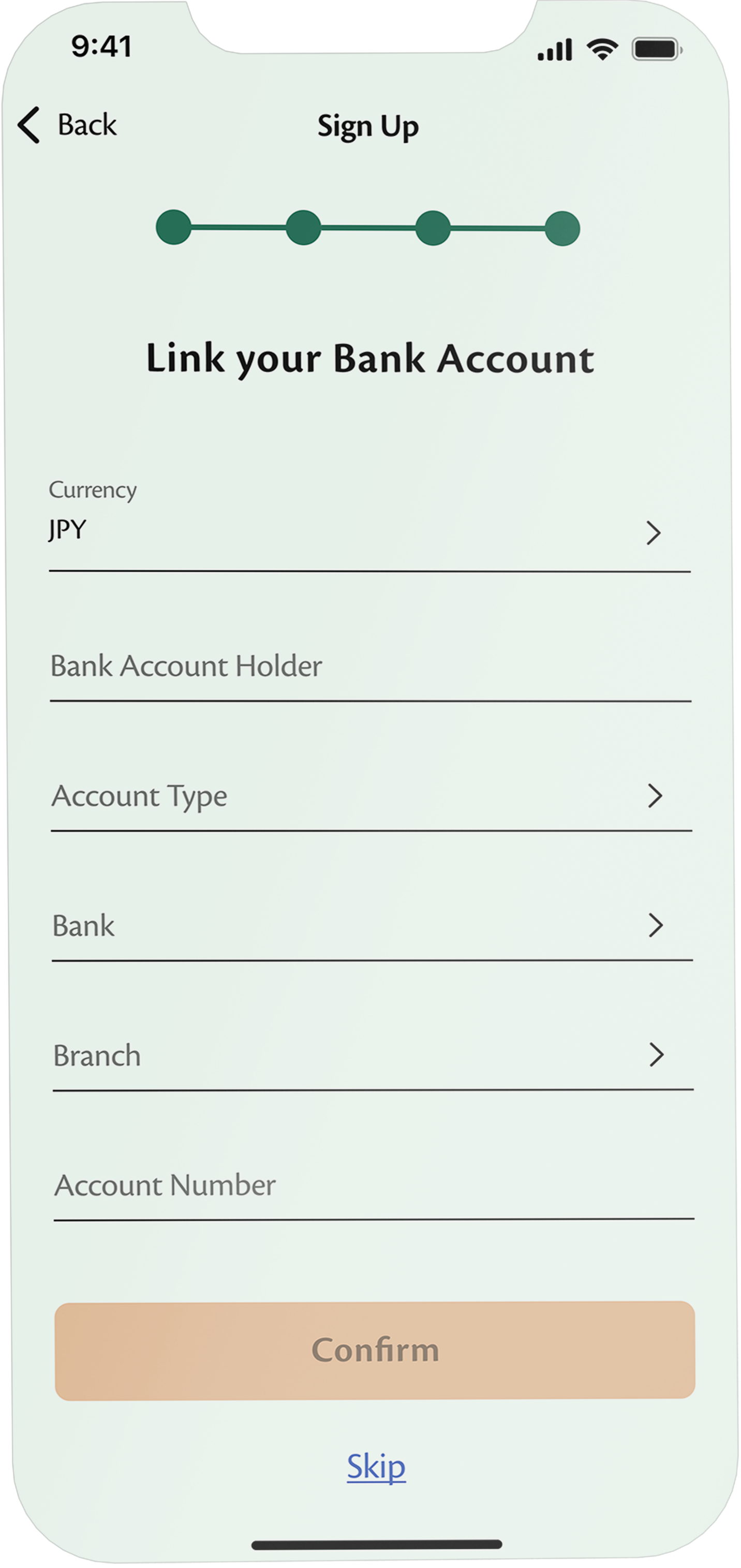
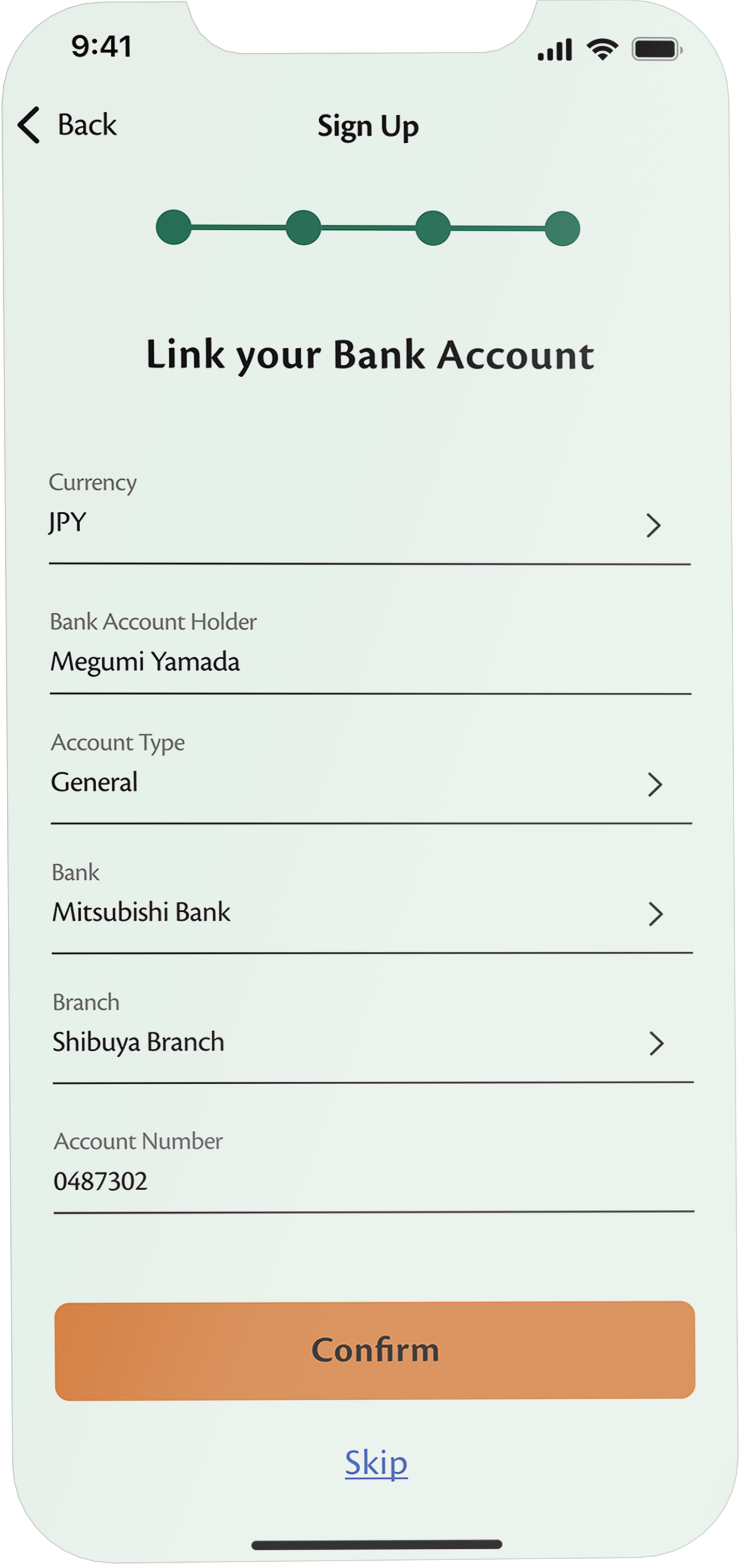
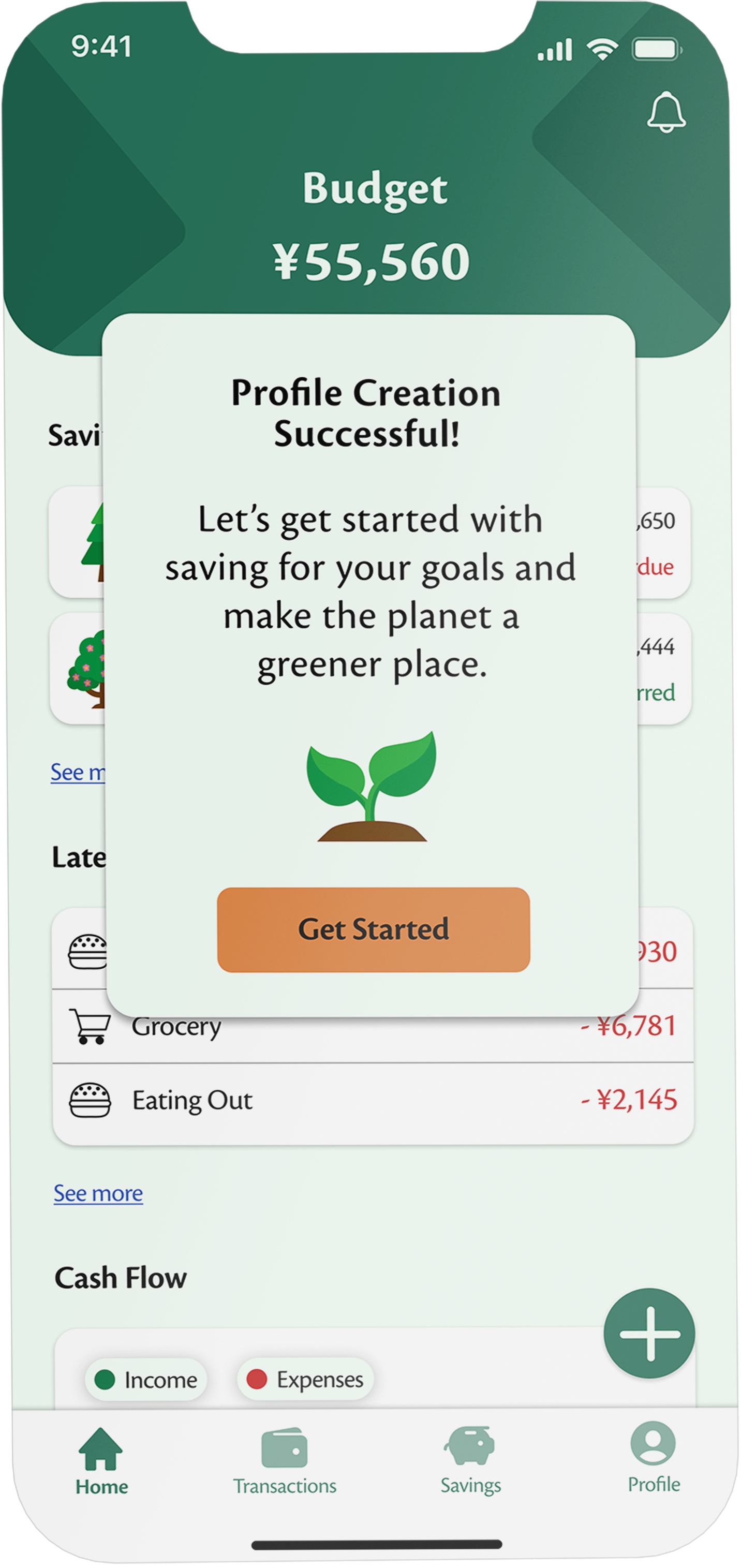
Users can link their bank account for seamless and easy money transfers.
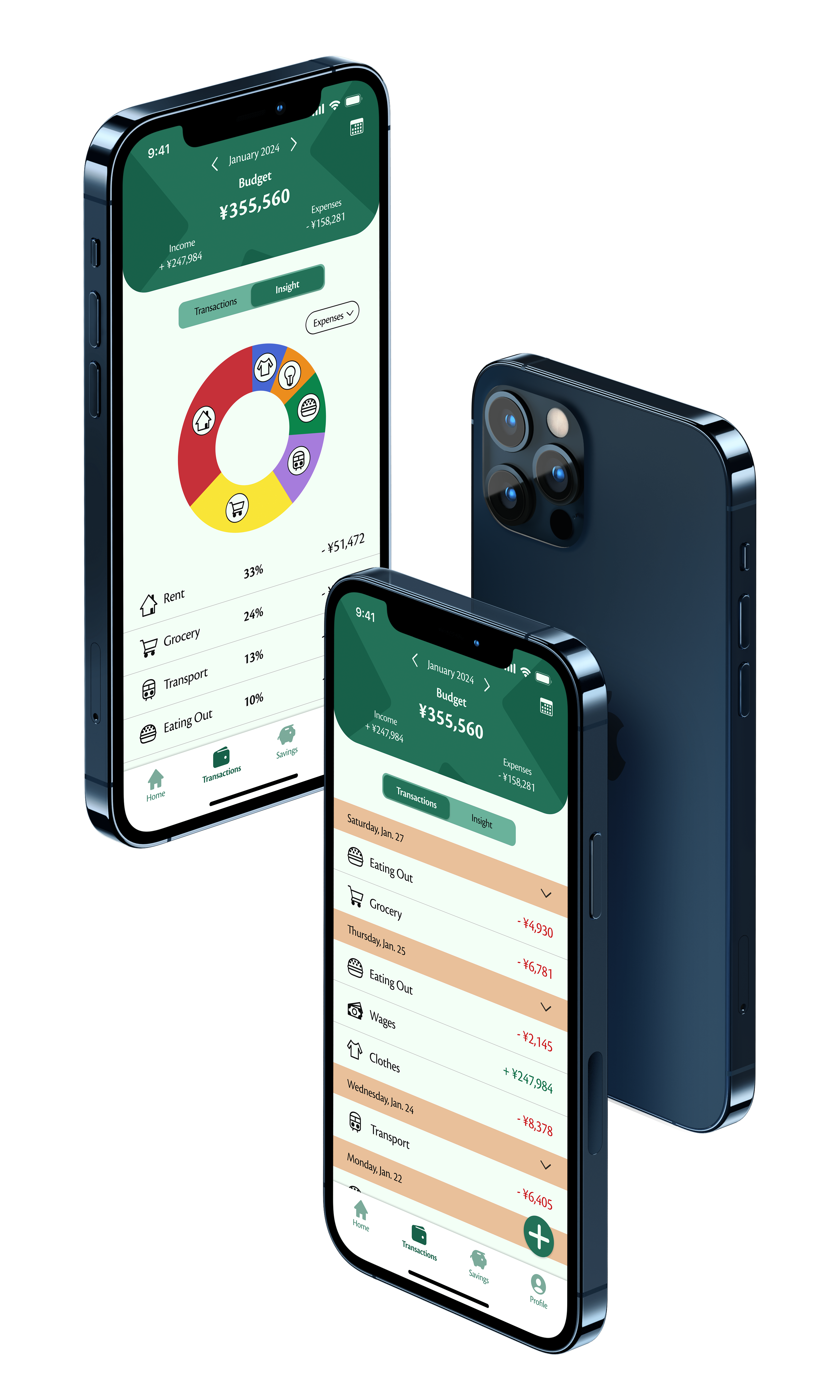
Uncomplicated process for tracking everyday spendings
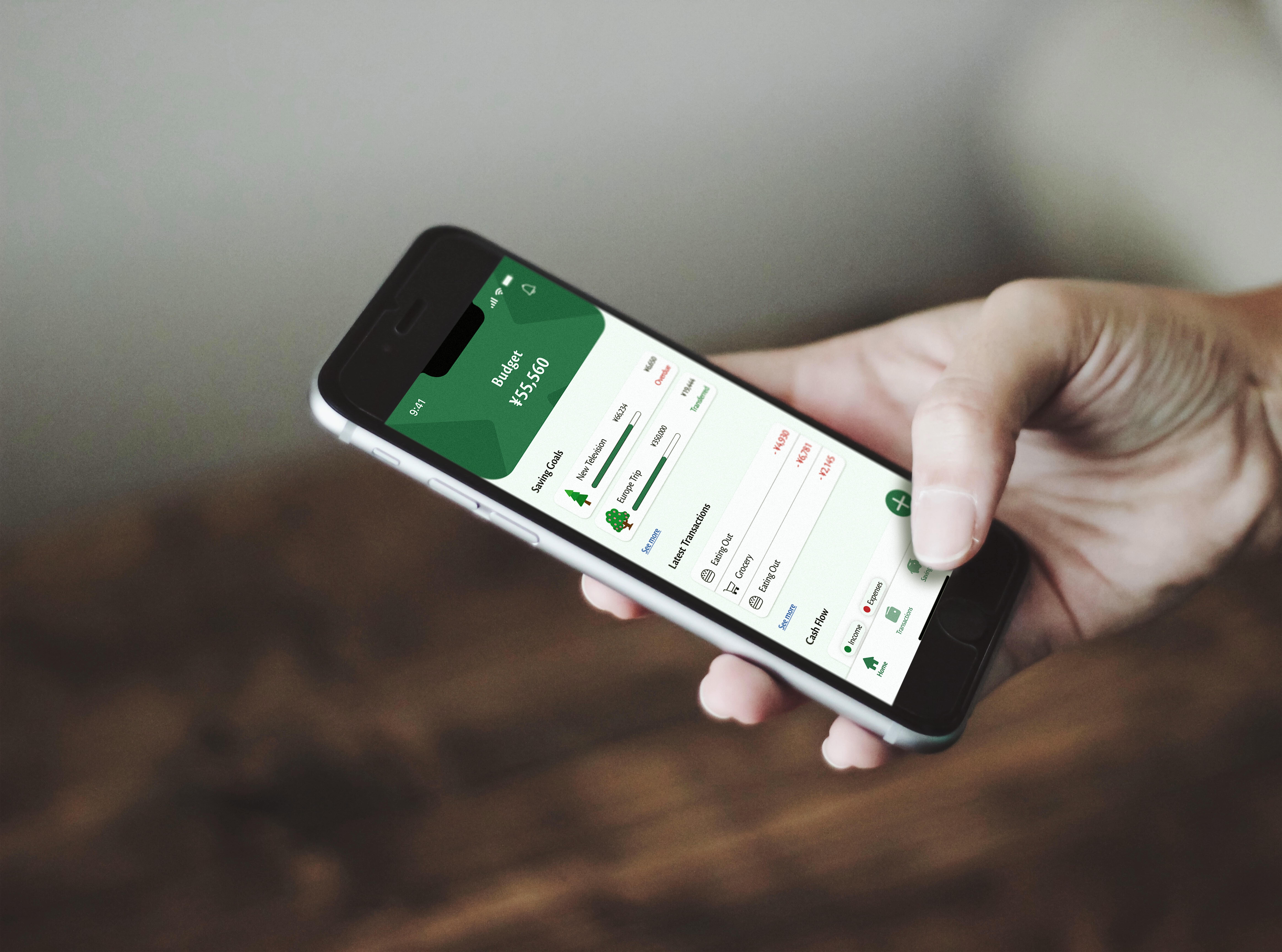
Given that users will utilize the app daily, it is crucial to simplify the tracking process, allowing them to easily monitor their everyday expenses. To achieve this, I implemented a straightforward transaction tracking process that can be easily accessed from various app screens.

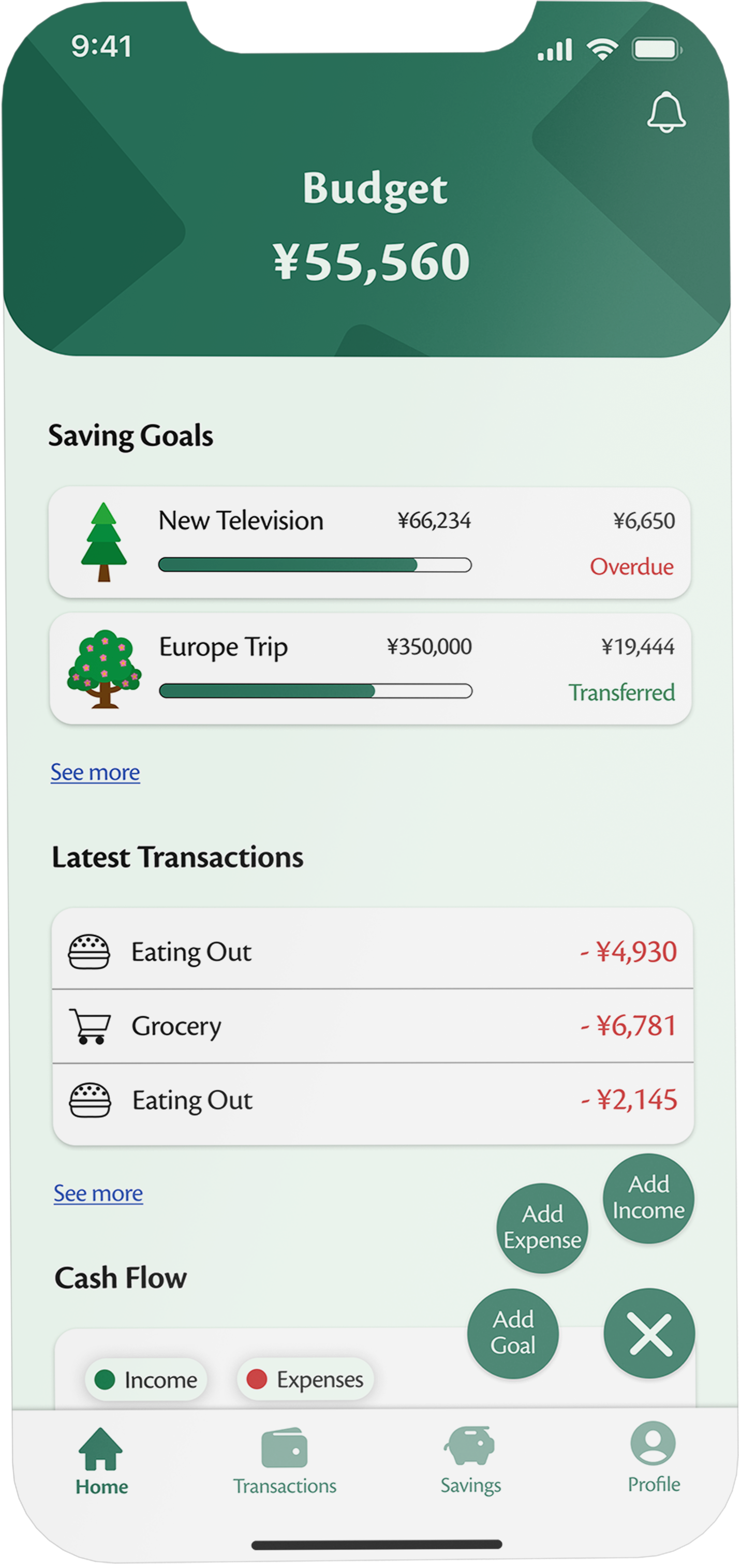
User can simply add new transactions directly from the home screen.
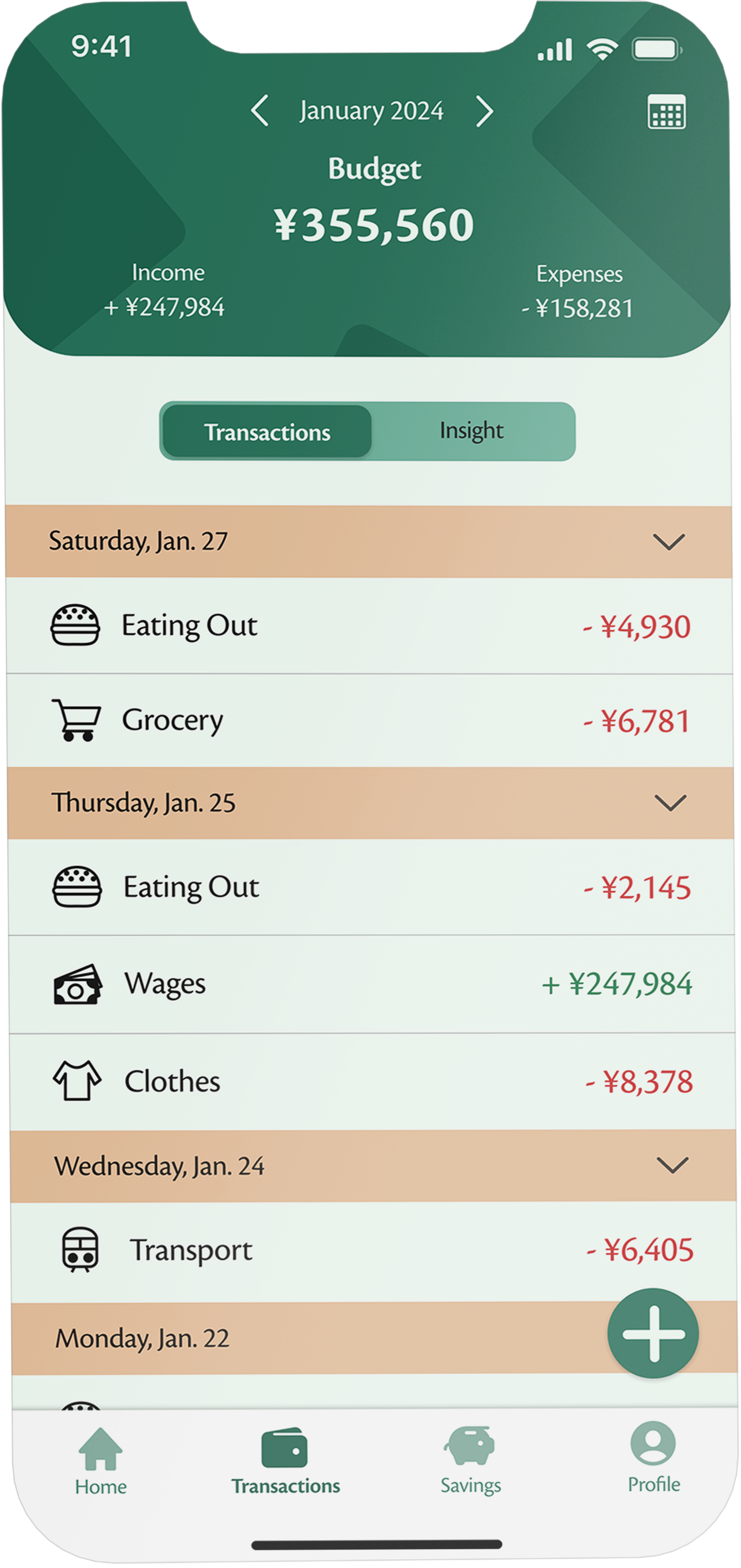
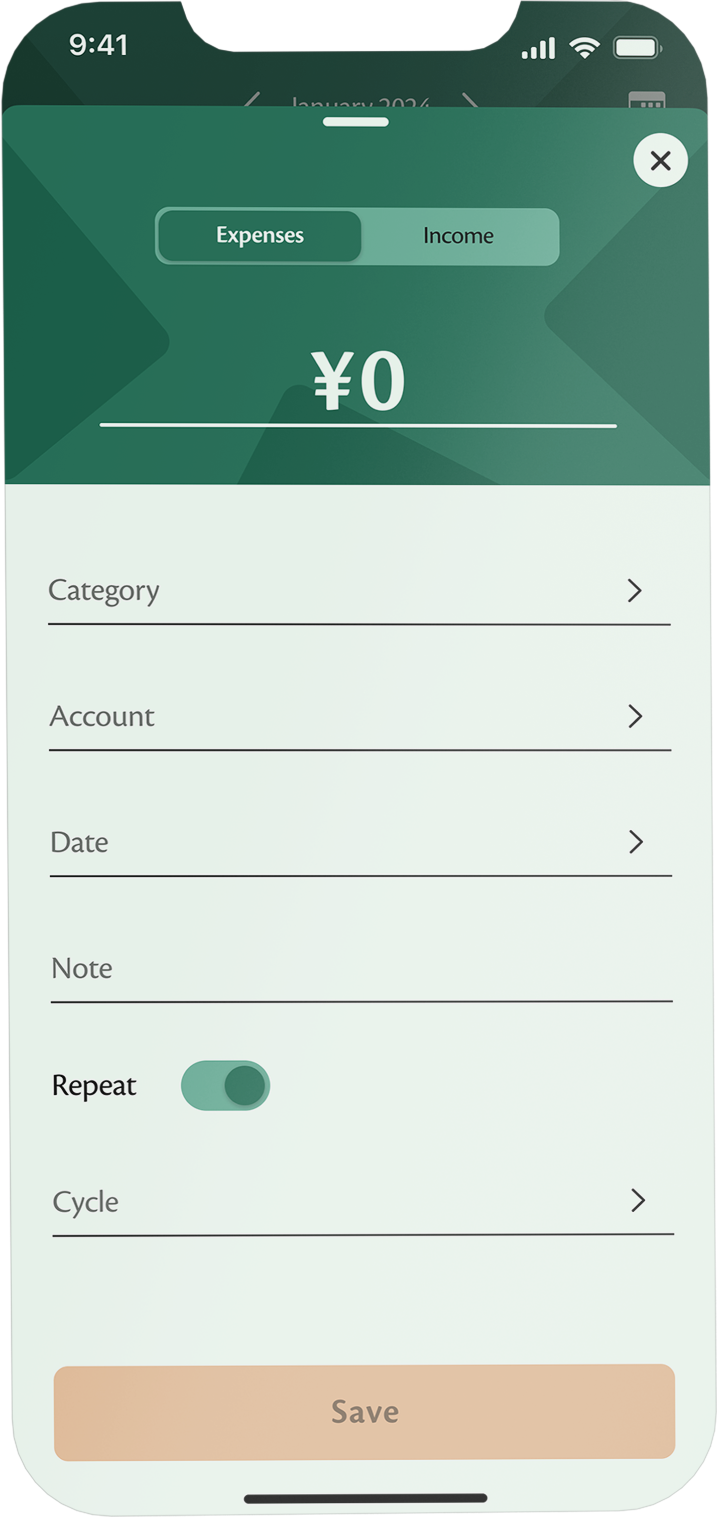
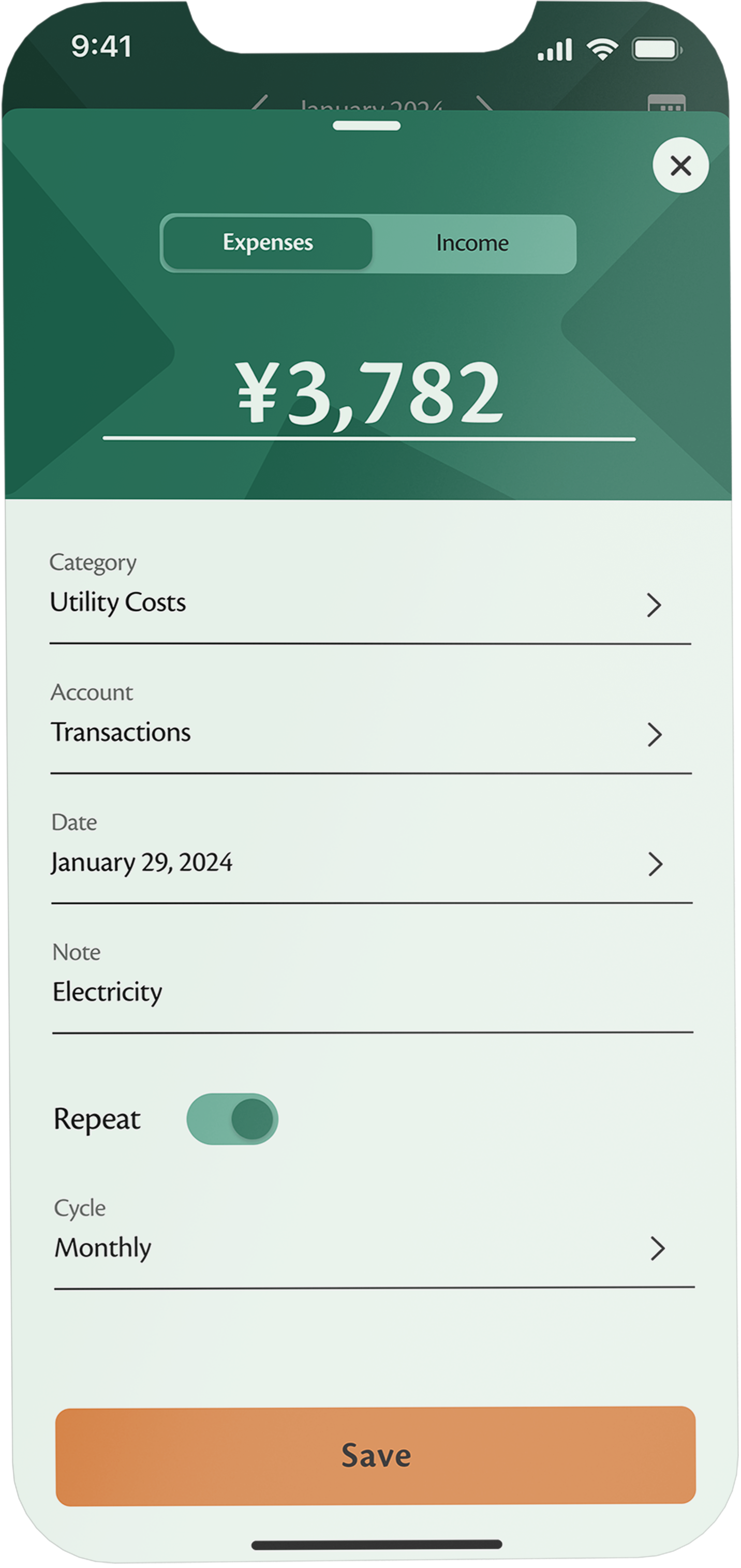
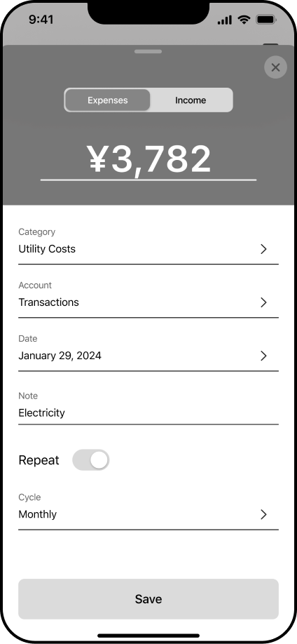
Or add transactions via the transaction screen with just a few simple steps.
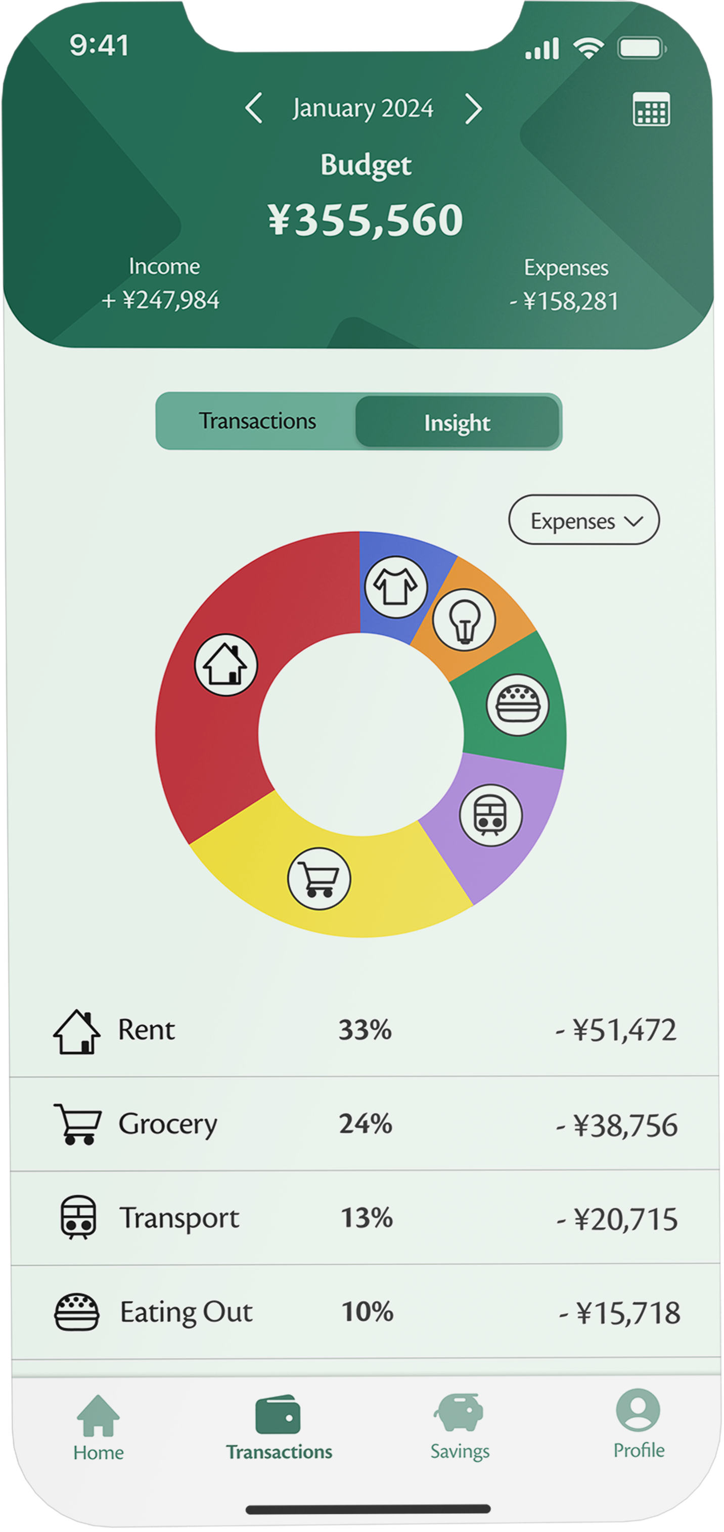
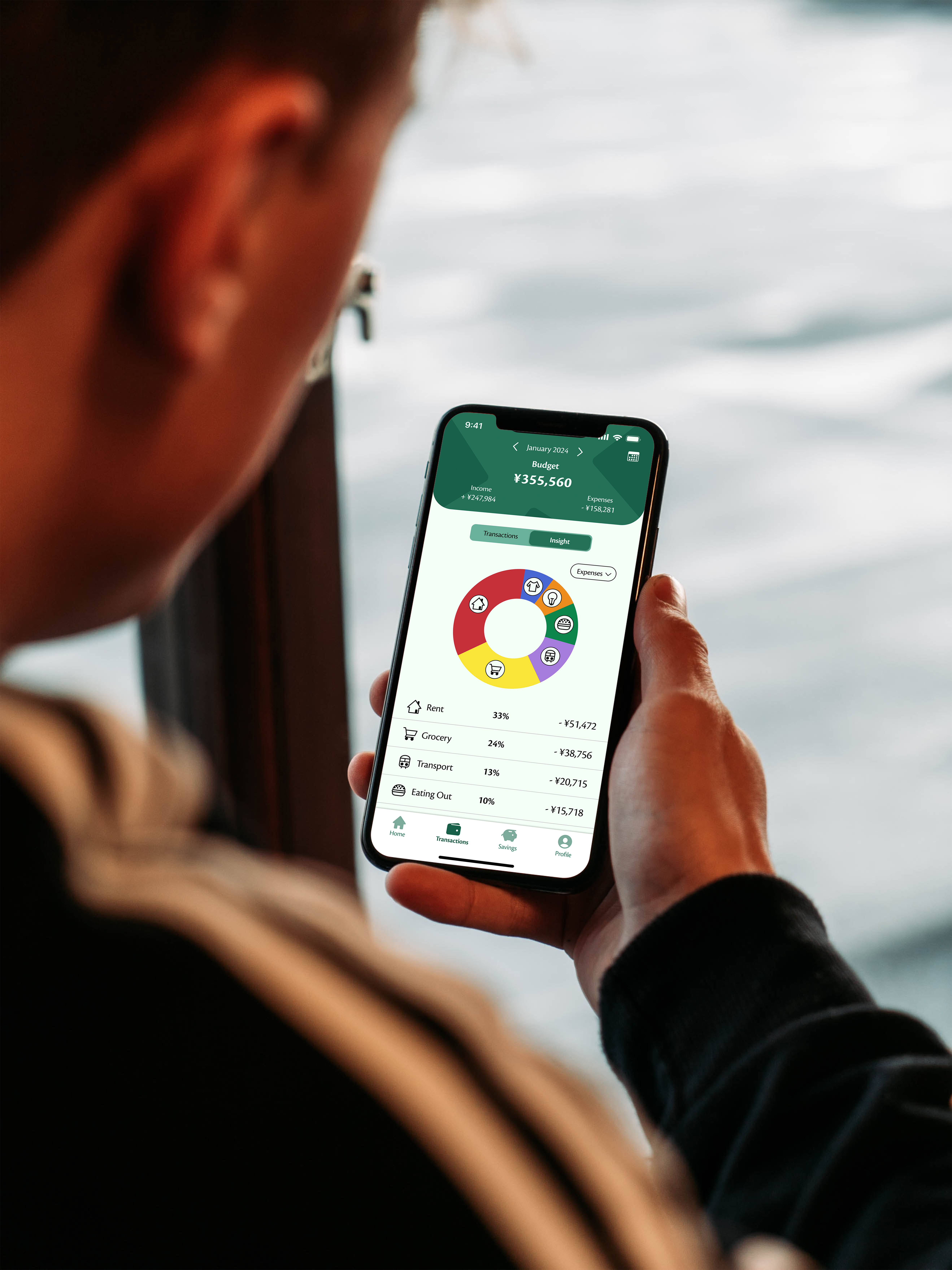
Categorize transactions, keep track of spending habits, and gain insights into monthly expenditures.
Making money saving fun and engaging: Plant a tree for every goal and see how your forest grows
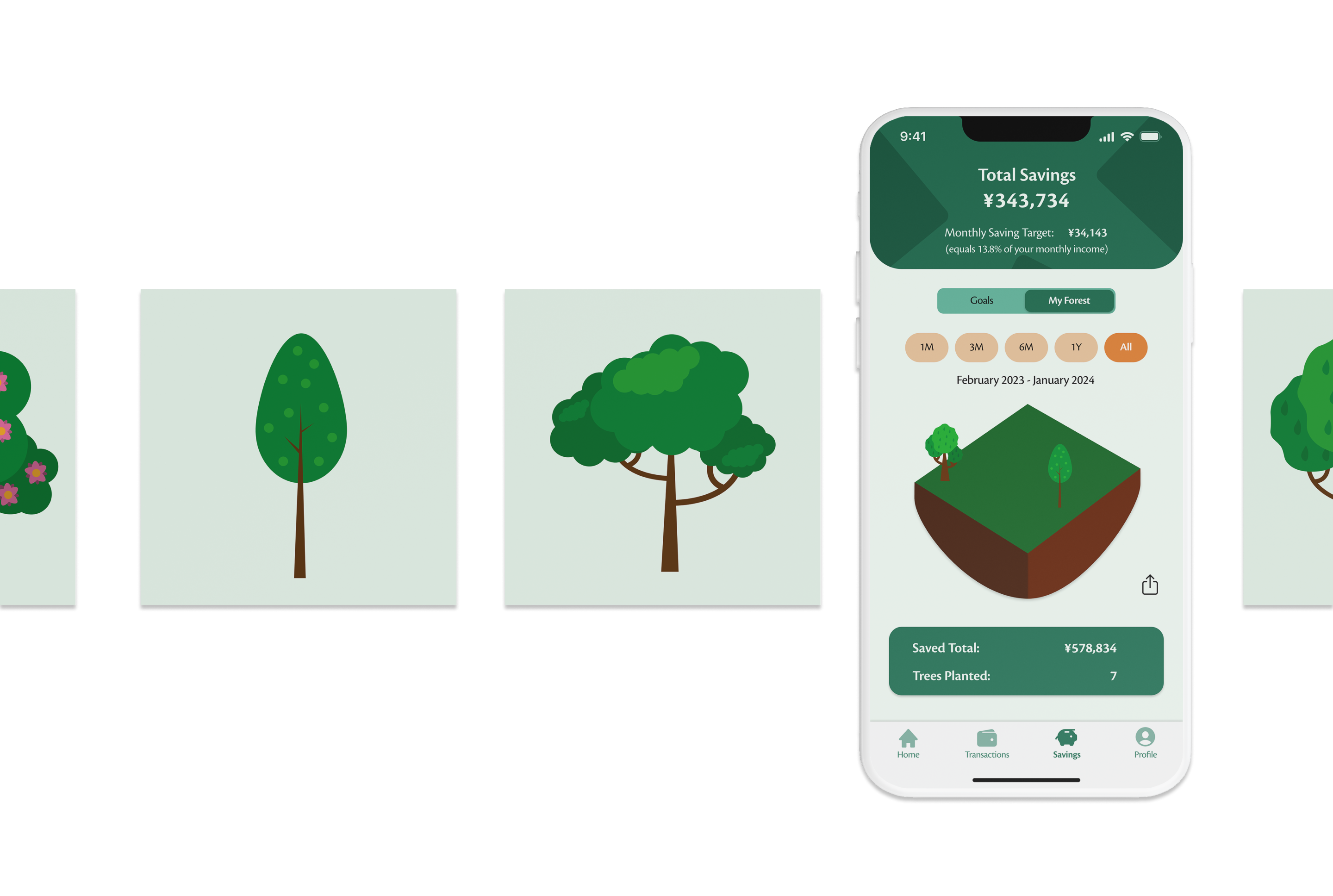
As money-saving can be a dull and unpleasant topic, making the saving process engaging and motivating is a crucial aspect of Plantwise. Users can collect tree illustrations and even plant real trees for every certain amount saved.
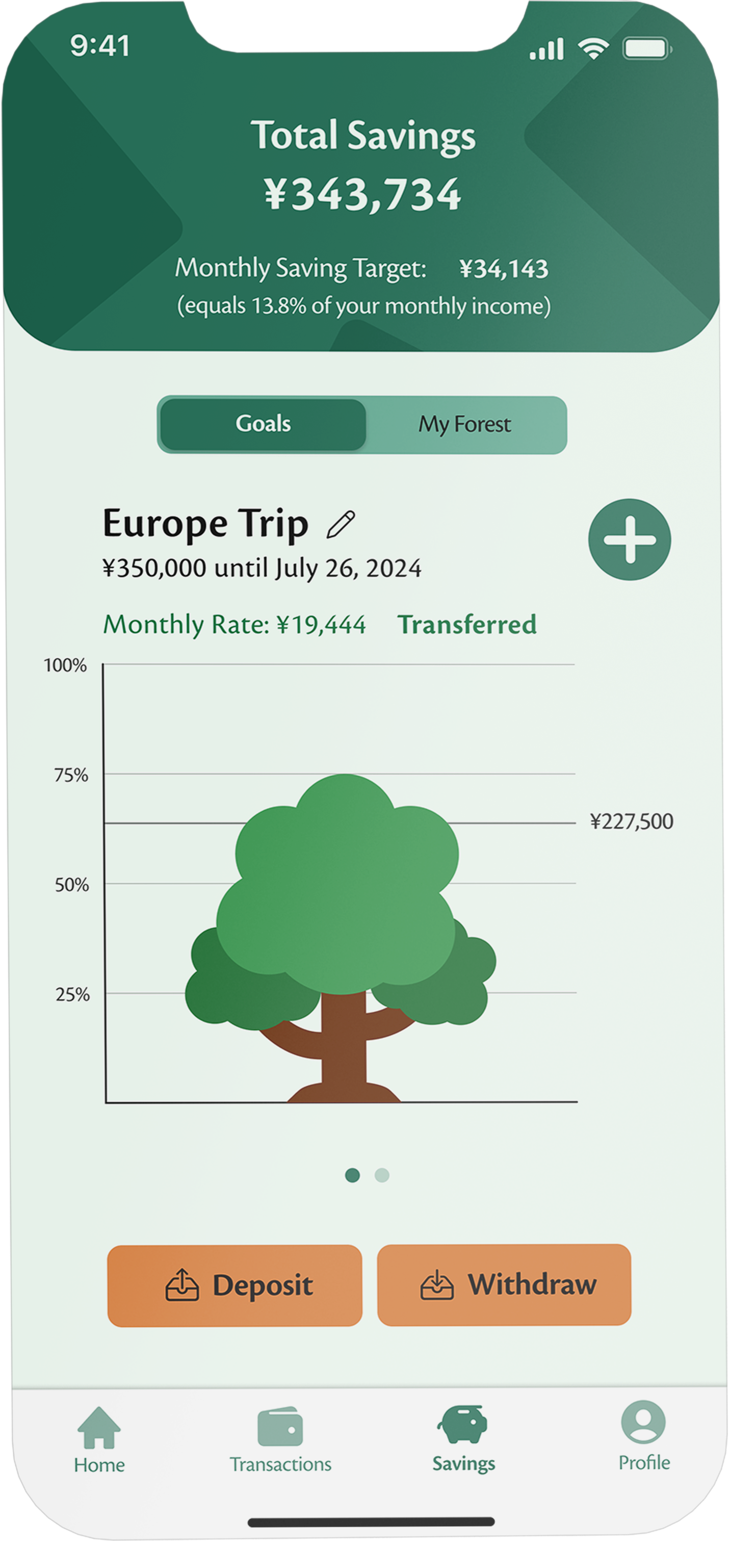
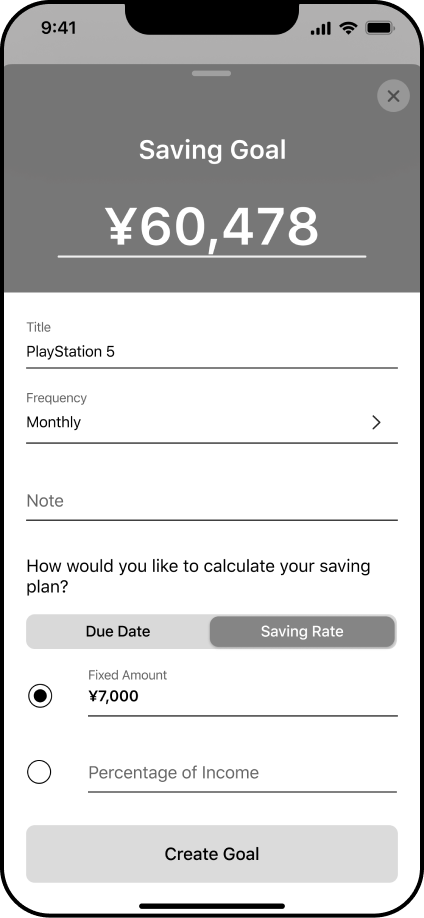
Save money and watch your tree and savings grow as you achieve your saving goals.
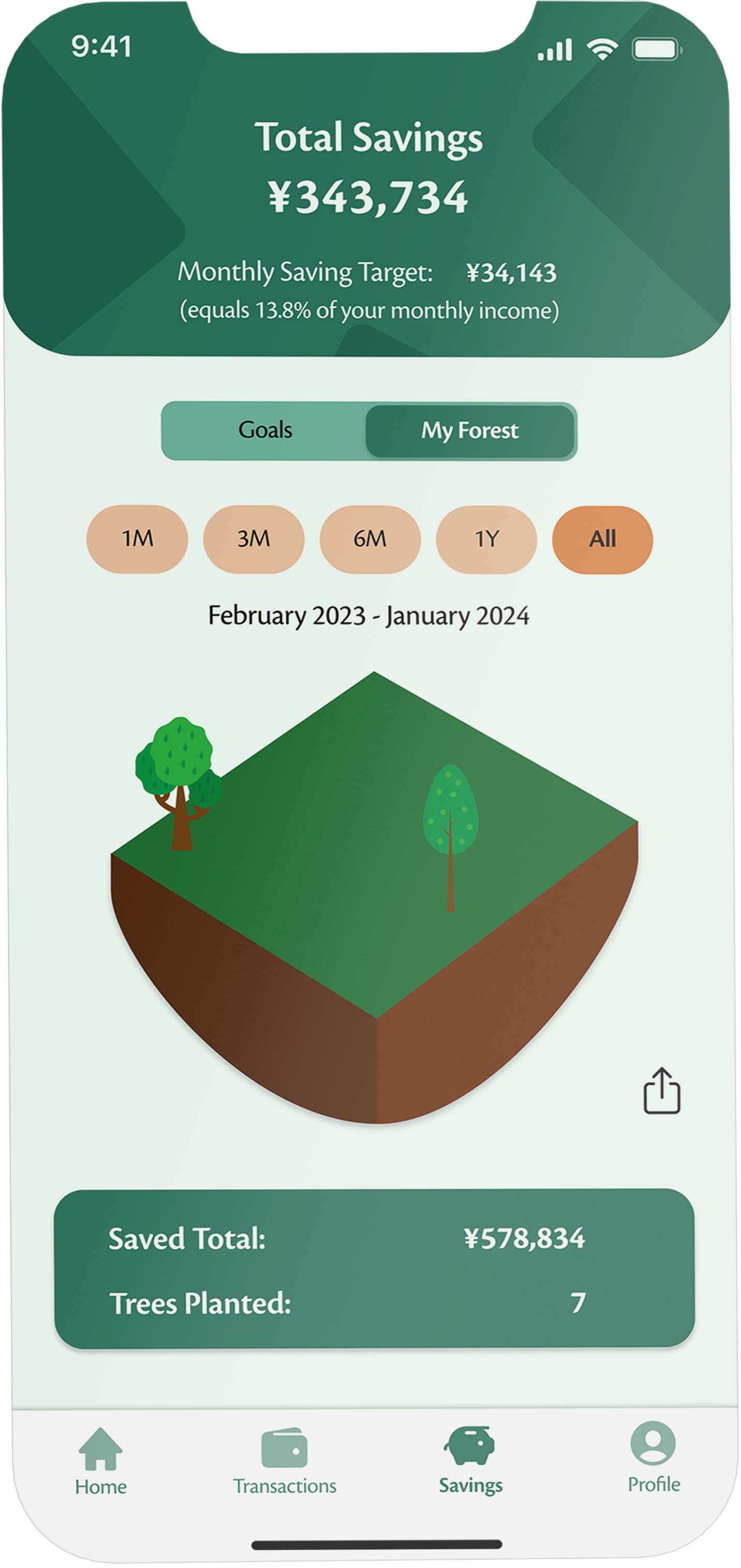
Collect trees and watch your forest grow with every saving goal you achieve. Keep track of your total savings and the real trees planted, or share your forest with friends.
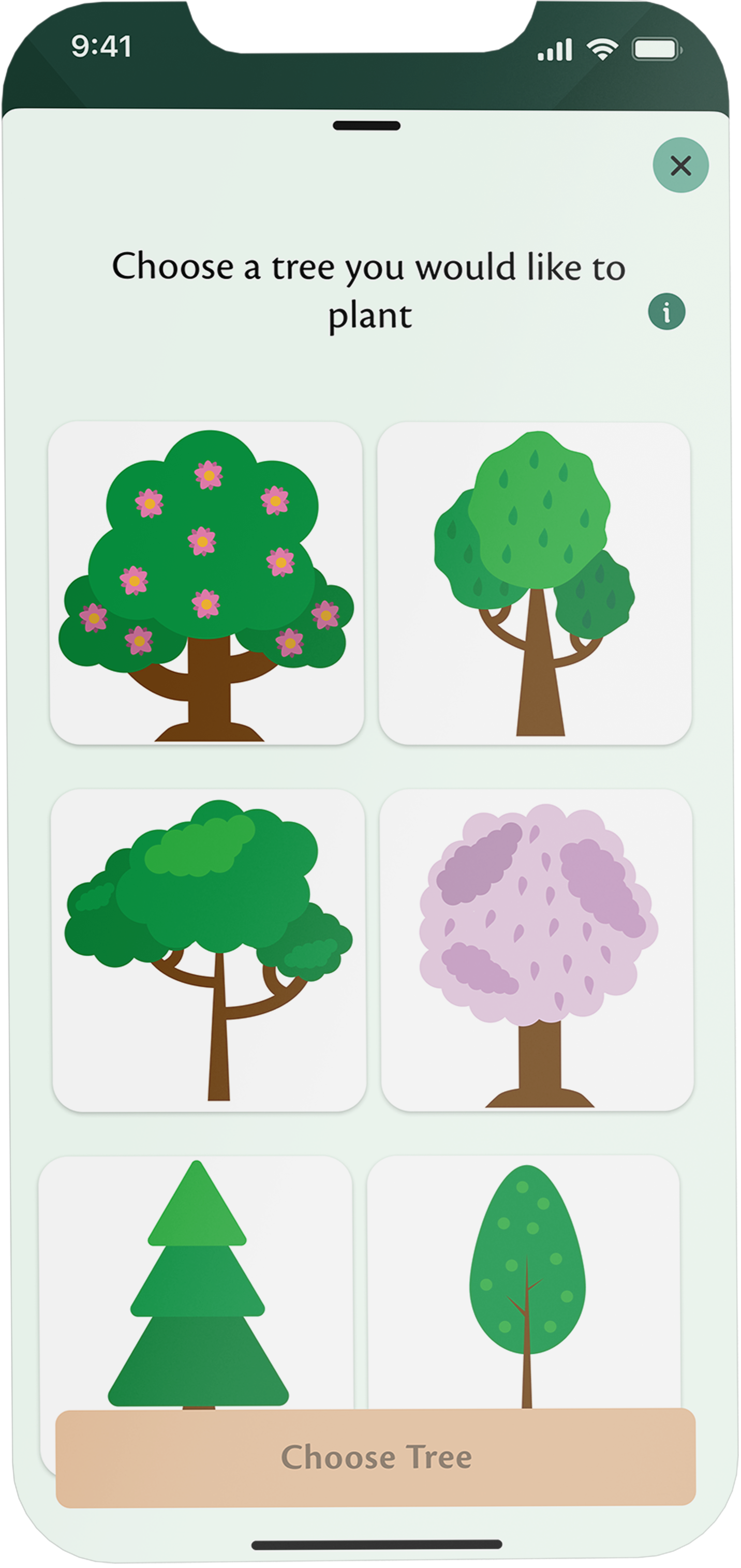
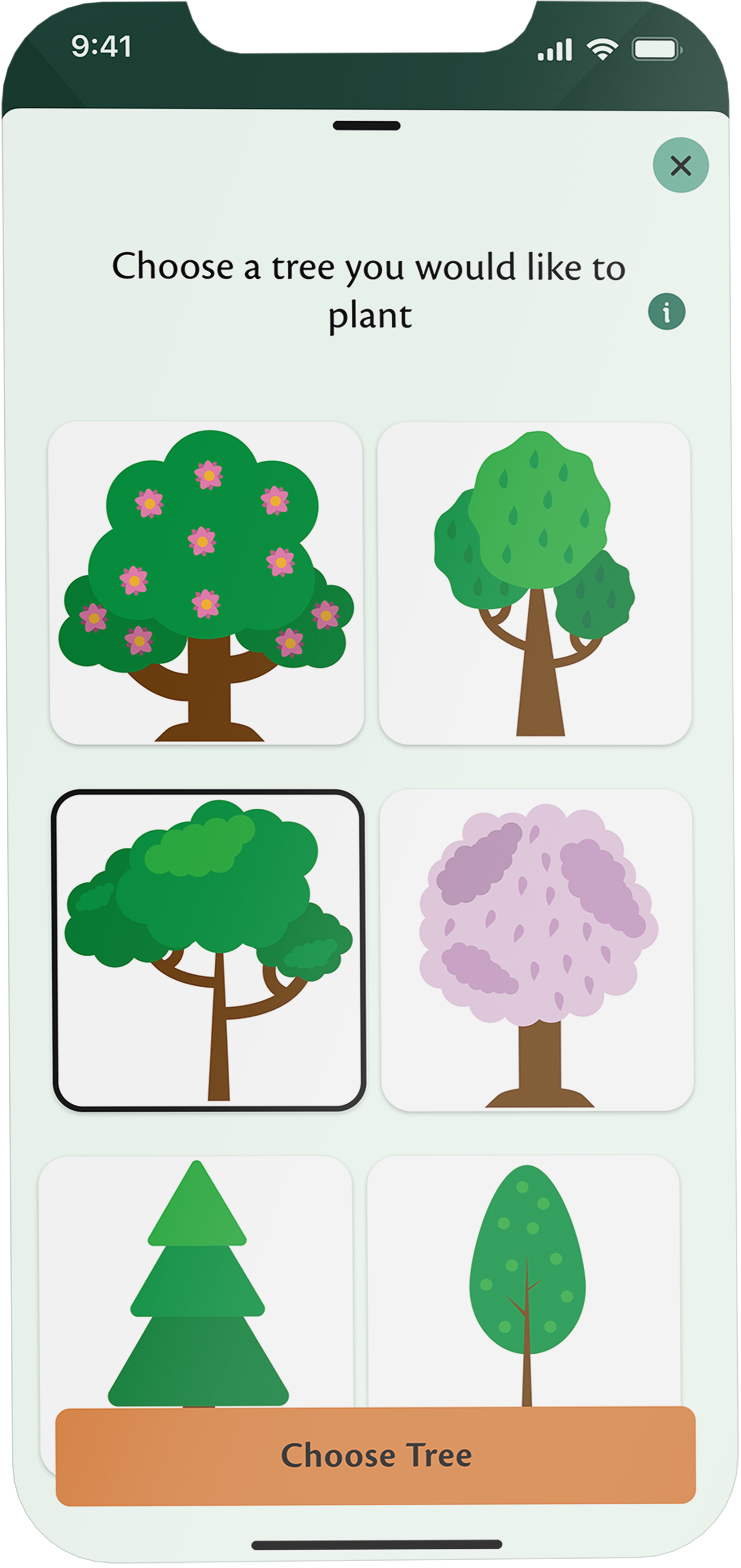
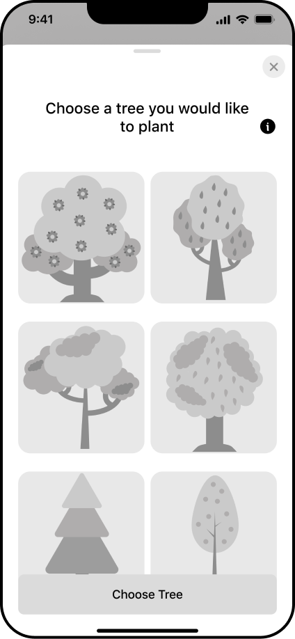
Choose a tree you want to grow from a variety of tree illustrations.
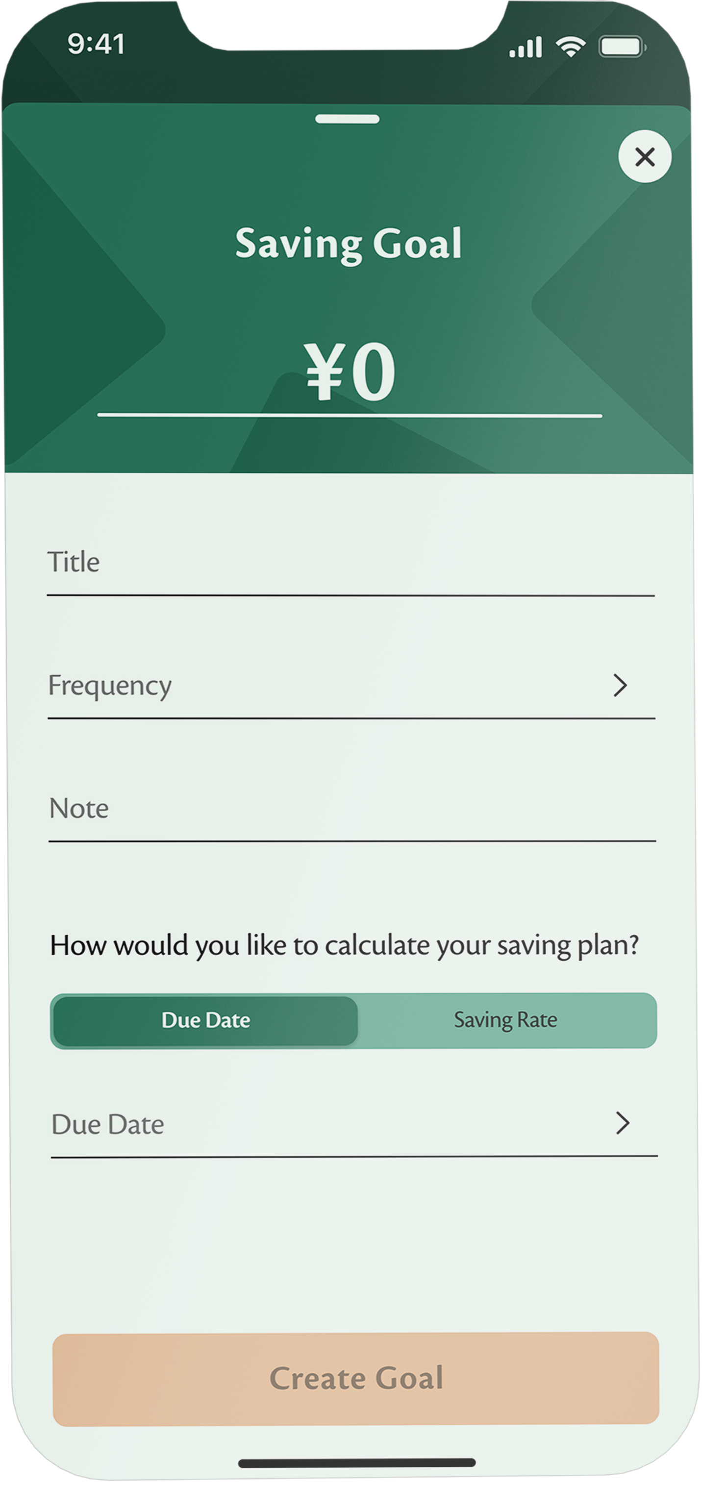
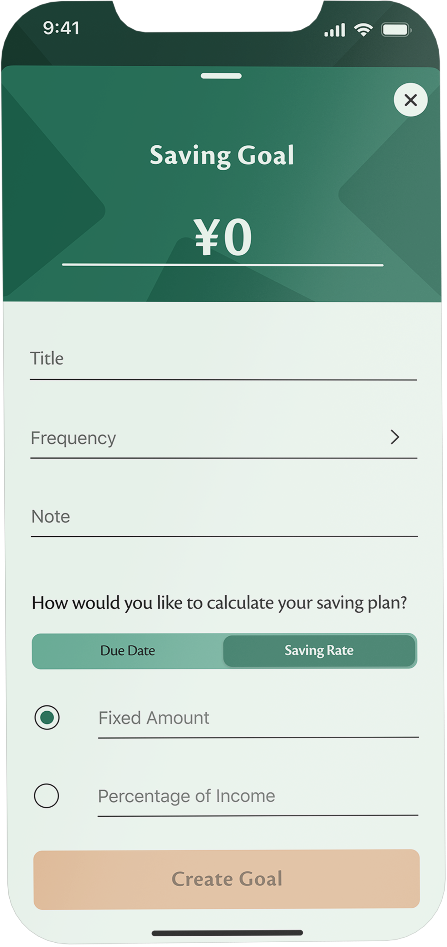
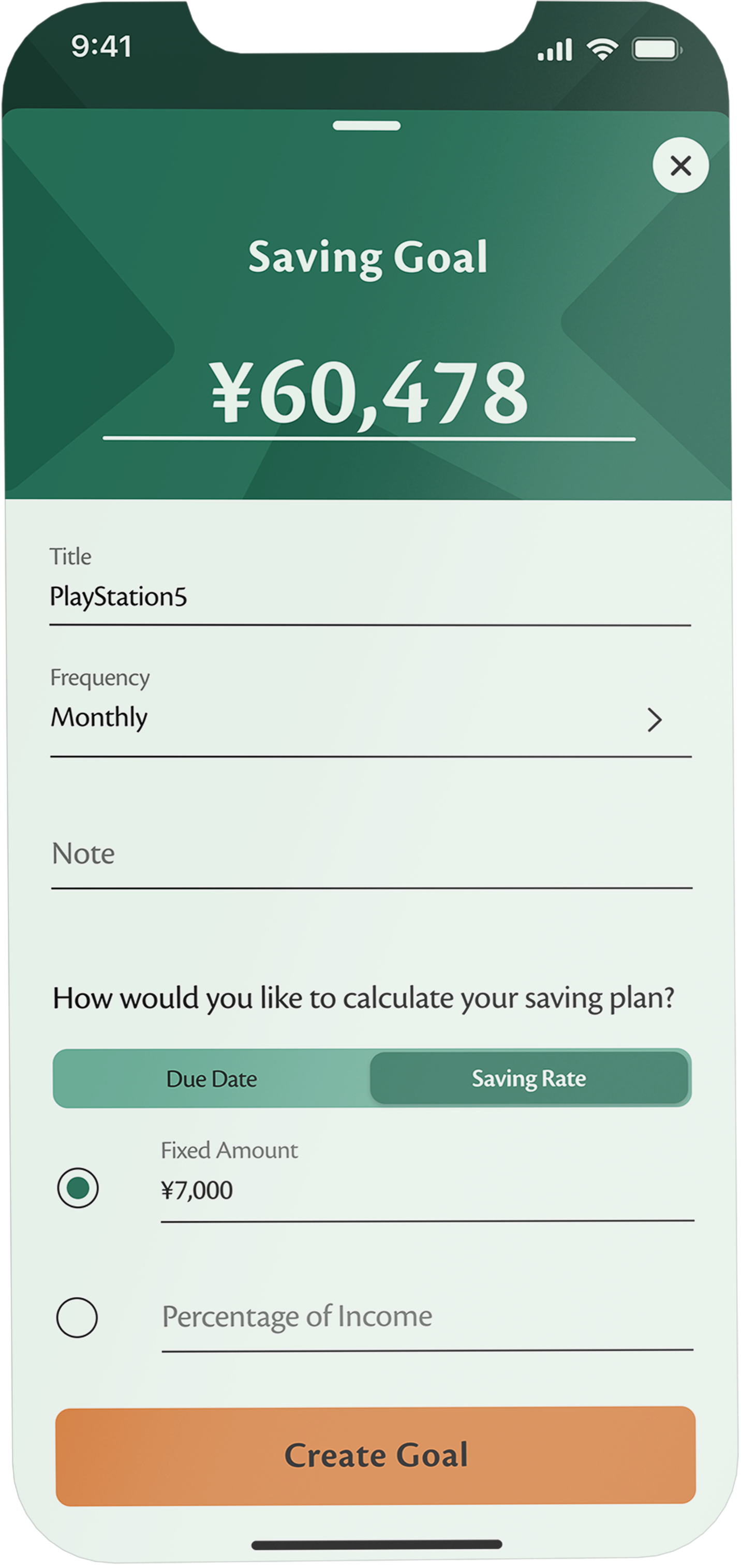
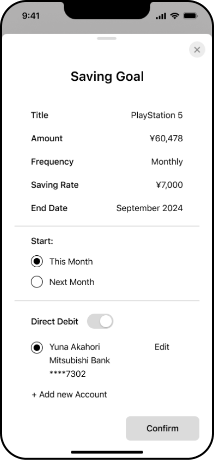
Transfer money manually every month or set uo a direct debit for an automatic and easy money transfer every month.
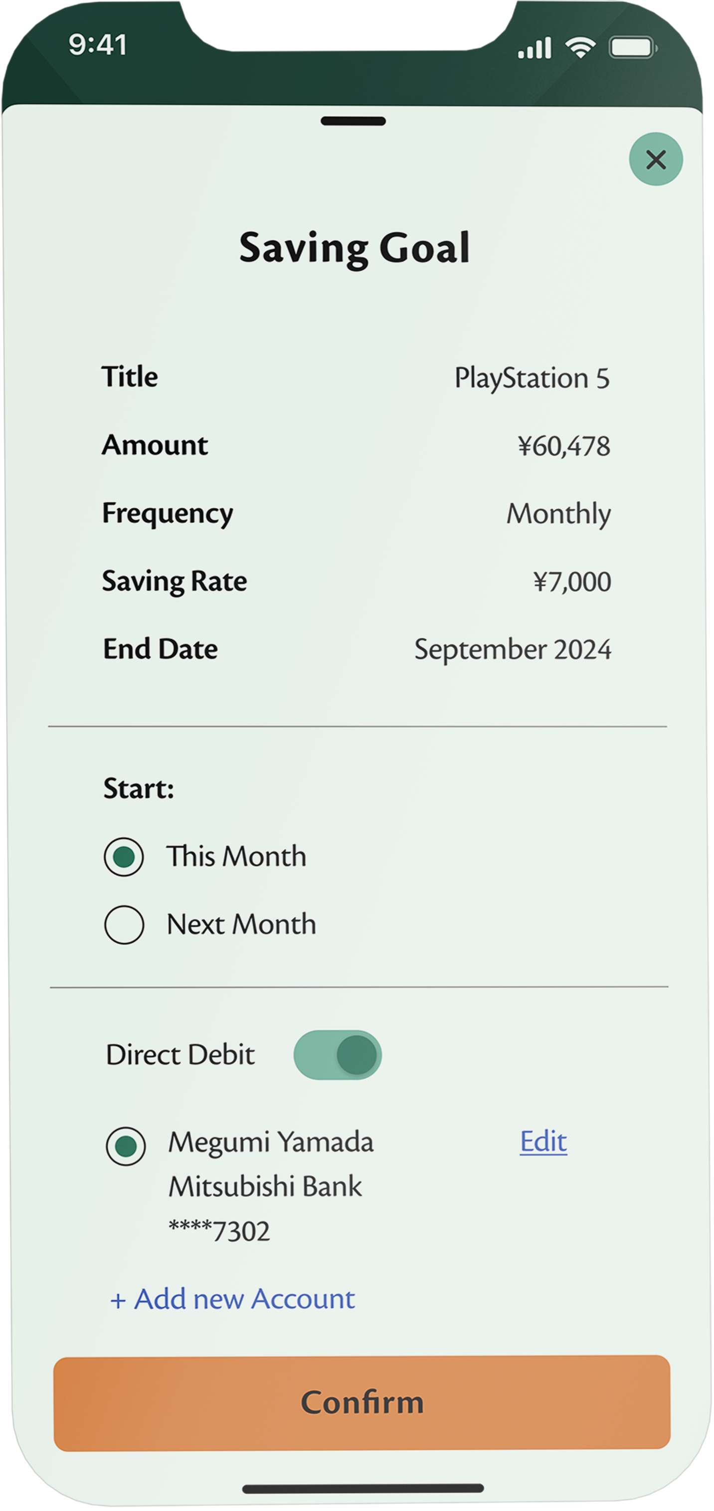
Transfer money manually every month or set uo a direct debit for an automatic and easy money transfer every month.
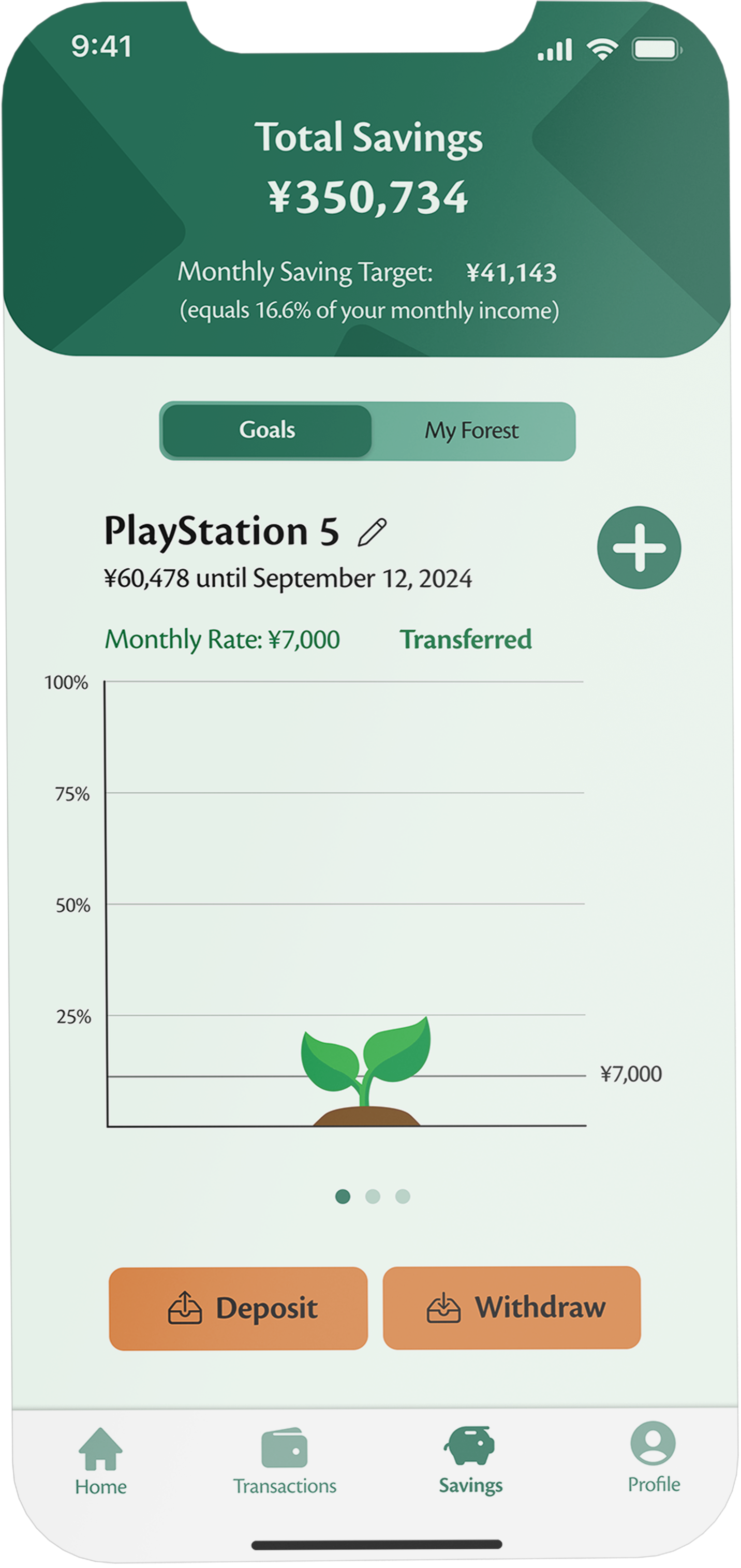
Start saving for your goals and contribute to making the planet greener.
Try it!
What I've learned
Make it as simple as possible for the user and provide different options
In my initial concept of the screens, I didn't include the functionality to directly add transactions or goals from the home screen. However, by only allowing the addition of new transactions and goals from the transaction and savings screens, there would always be an extra step for the user. Especially for everyday use, this small extra step can quickly add up, leading to user frustration. Therefore, providing the fastest and easiest way for the user is crucial to ensure a pleasurable user experience.